Annual Report 2004-2005 - City of Vincent
Annual Report 2004-2005 - City of Vincent
Annual Report 2004-2005 - City of Vincent

Create successful ePaper yourself
Turn your PDF publications into a flip-book with our unique Google optimized e-Paper software.
T OWN OF V INCENT L OGO<br />
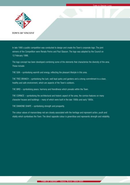
In late 1995 a public competition was conducted to design and create the Town’s corporate logo. The joint<br />
winners <strong>of</strong> the Competition were Renato Perino and Paul Glasson. The logo was adopted by the Council on<br />
12 February 1996.<br />
The logo concept has been developed combining some <strong>of</strong> the elements that characterise the diversity <strong>of</strong> the area.<br />
These include:<br />
THE SUN – symbolising warmth and energy, reflecting the pleasant lifestyle in this area.<br />
THE TREE BRANCH – symbolising the lush, well kept parks and gardens and a strong commitment to a clean,<br />
healthy and safe environment, which are aspects <strong>of</strong> the Town’s outdoors.<br />
THE BIRD – symbolising peace, harmony and friendliness which prevails within the Town.<br />
THE CORNICE – symbolising the architectural and historic aspect <strong>of</strong> the area, the cornice features on many<br />
character houses and buildings – many <strong>of</strong> which were built in the late 1890s and early 1900s.<br />
THE DIAMOND SHAPE – symbolising strength and prosperity.<br />
The colour values <strong>of</strong> maroon/deep red are closely associated with the heritage and represent action, youth and<br />
vitality which symbolises the Town. The direct opposite colour is green/blue and represents strength and reliability.<br />
TOWN OF VINCENT _ A NNUAL R EPORT <strong>2004</strong>-<strong>2005</strong>