Download PDF - COINAtlantic
Download PDF - COINAtlantic
Download PDF - COINAtlantic
- No tags were found...
You also want an ePaper? Increase the reach of your titles
YUMPU automatically turns print PDFs into web optimized ePapers that Google loves.
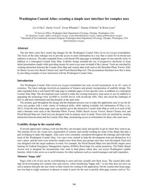
Washington Coastal Atlas: creating a simple user interface for complex usesLiz O’Dea 1 , Darby Veeck 1 , Ewan Whitaker 1 , Tammy Pelletier 1 & Brian Lynn 21 IT Services Office, Washington State Department of Ecology, Olympia, Washington, USAliz.odea@ecy.wa.gov, darby.veeck@ecy.wa.gov, ewan.whitwaker@ecy.wa.gov, tammy.pelletier@ecy.wa.gov2 Shorelands & Environmental Assistance Program, Washington State Department of Ecology, Olympia, Washington, USAbrian.lynn@ecy.wa.govAbstractThe last three years have meant big changes for the Washington Coastal Atlas (www.ecy.wa.gov/coastalatlas).The focus of the atlas redesign was to provide access to more information in a way that is easier for its broad useraudience to process. The atlas expanded from a web-based GIS map page to multiple pages of user-specific tools, inaddition to a redesigned Coastal Atlas Map. Usability design included the use of progressive disclosure to keepinitial presentation simple while providing means for users to go more in-depth if they choose. Tools are enriched bycreating interaction between the Coastal Atlas Map and various atlas tools such as the Shoreline Photo Viewer, PublicBeach Access tool, Beach Closure tool, and Flood Hazard Map tool. This presentation illustrates how this is doneby providing examples of user interaction with the Washington Coastal Atlas.IntroductionThe Washington Coastal Atlas (www.ecy.wa.gov/coastalatlas) has seen several incarnations in its 10+ years ofexistence. The latest redesign involved an expansion of features and greater incorporation of usability design. Theatlas expanded from a web-based GIS map page to multiple pages of user-specific tools, in addition to a redesignedCoastal Atlas Map. The development team wanted to make the existing interactive map easier to use (in addition toupgrading the technology from ArcIMS to ArcGIS Server with JavaScript API). They also faced the challenge ofhow to add more information and functionality at the same time.The primary goal throughout the design and development process was to make the application easy to use for diverseuser groups with a wide variety of technical skills, while making available rich information (O’Dea et al.,2011). From the atlas home page users can quickly get to the interactive Coastal Atlas Map as well as to each of theatlas’s thematic tools such as the Shoreline Photo Viewer, Public Beach Access Viewer, Beach Closure tool, andFlood Hazard Map tool. Each tool was designed with its primary users in mind. These tools are enriched by creatinginteraction between them and the Coastal Atlas Map, streamlining access to information for those who want more.Usability design in the coastal atlasEveryone appreciates visiting a web site that they can navigate easily and quickly to get to where they want to go.The amount of text, the visual cues, organization of content, and careful wording are some of the things that play apart in helping to make that happen. Atlas users were constantly considered throughout the redesign and redevelopmentof the Washington Coastal Atlas. Use cases were created to help the development team put themselves in auser’s place, and the tools were tested by sample users from those user groups once they were developed. Each toolwas designed with the target audience in mind. For example, the Flood Hazard Maps tool specifically targets userslooking for Federal Emergency Management Agency (FEMA) flood maps for certain properties. The Public BeachAccess tool is designed for recreationists who want to find places where they can access Washington’s publicbeaches, while it also serves as a useful resource for other audiences such as coastal managers and spill responders.Minimize “happy talk”Pages with a lot of text can be overwhelming to users and may actually turn them away. The coastal atlas redesigninvolved keeping text content clear and concise, while minimizing “happy talk,” or text that does not serve anactive purpose that gets the user closer to their reason for coming to the application. On the coastal atlas home page,text was kept to single sentences or phrases to make it easier for the user to quickly skim page content, such as “Ex-168


