Washington Coastal Atlas: creating a simple user interface for complex usesLiz O’Dea 1 , Darby Veeck 1 , Ewan Whitaker 1 , Tammy Pelletier 1 & Brian Lynn 21 IT Services Office, Washington State Department of Ecology, Olympia, Washington, USAliz.odea@ecy.wa.gov, darby.veeck@ecy.wa.gov, ewan.whitwaker@ecy.wa.gov, tammy.pelletier@ecy.wa.gov2 Shorelands & Environmental Assistance Program, Washington State Department of Ecology, Olympia, Washington, USAbrian.lynn@ecy.wa.govAbstractThe last three years have meant big changes for the Washington Coastal Atlas (www.ecy.wa.gov/coastalatlas).The focus of the atlas redesign was to provide access to more information in a way that is easier for its broad useraudience to process. The atlas expanded from a web-based GIS map page to multiple pages of user-specific tools, inaddition to a redesigned Coastal Atlas Map. Usability design included the use of progressive disclosure to keepinitial presentation simple while providing means for users to go more in-depth if they choose. Tools are enriched bycreating interaction between the Coastal Atlas Map and various atlas tools such as the Shoreline Photo Viewer, PublicBeach Access tool, Beach Closure tool, and Flood Hazard Map tool. This presentation illustrates how this is doneby providing examples of user interaction with the Washington Coastal Atlas.IntroductionThe Washington Coastal Atlas (www.ecy.wa.gov/coastalatlas) has seen several incarnations in its 10+ years ofexistence. The latest redesign involved an expansion of features and greater incorporation of usability design. Theatlas expanded from a web-based GIS map page to multiple pages of user-specific tools, in addition to a redesignedCoastal Atlas Map. The development team wanted to make the existing interactive map easier to use (in addition toupgrading the technology from ArcIMS to ArcGIS Server with JavaScript API). They also faced the challenge ofhow to add more information and functionality at the same time.The primary goal throughout the design and development process was to make the application easy to use for diverseuser groups with a wide variety of technical skills, while making available rich information (O’Dea et al.,2011). From the atlas home page users can quickly get to the interactive Coastal Atlas Map as well as to each of theatlas’s thematic tools such as the Shoreline Photo Viewer, Public Beach Access Viewer, Beach Closure tool, andFlood Hazard Map tool. Each tool was designed with its primary users in mind. These tools are enriched by creatinginteraction between them and the Coastal Atlas Map, streamlining access to information for those who want more.Usability design in the coastal atlasEveryone appreciates visiting a web site that they can navigate easily and quickly to get to where they want to go.The amount of text, the visual cues, organization of content, and careful wording are some of the things that play apart in helping to make that happen. Atlas users were constantly considered throughout the redesign and redevelopmentof the Washington Coastal Atlas. Use cases were created to help the development team put themselves in auser’s place, and the tools were tested by sample users from those user groups once they were developed. Each toolwas designed with the target audience in mind. For example, the Flood Hazard Maps tool specifically targets userslooking for Federal Emergency Management Agency (FEMA) flood maps for certain properties. The Public BeachAccess tool is designed for recreationists who want to find places where they can access Washington’s publicbeaches, while it also serves as a useful resource for other audiences such as coastal managers and spill responders.Minimize “happy talk”Pages with a lot of text can be overwhelming to users and may actually turn them away. The coastal atlas redesigninvolved keeping text content clear and concise, while minimizing “happy talk,” or text that does not serve anactive purpose that gets the user closer to their reason for coming to the application. On the coastal atlas home page,text was kept to single sentences or phrases to make it easier for the user to quickly skim page content, such as “Ex-168
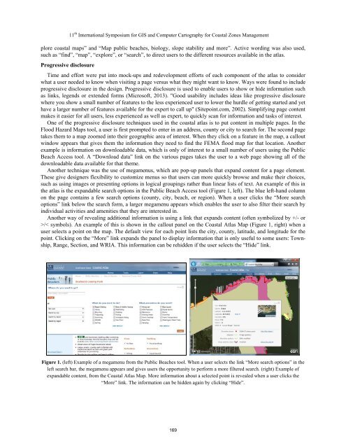
11 th International Symposium for GIS and Computer Cartography for Coastal Zones Managementplore coastal maps” and “Map public beaches, biology, slope stability and more”. Active wording was also used,such as “find”, “map”, “explore”, or “search”, to direct users to the different resources available in the atlas.Progressive disclosureTime and effort were put into mock-ups and redevelopment efforts of each component of the atlas to considerwhat a user needed to know when visiting a page versus what they might want to know. Ways were found to includeprogressive disclosure in the design. Progressive disclosure is used to enable users to show or hide information suchas links, legends or extended forms (Microsoft, 2013). "Good usability includes ideas like progressive disclosurewhere you show a small number of features to the less experienced user to lower the hurdle of getting started and yethave a larger number of features available for the expert to call up" (Sitepoint.com, 2002). Simplifying page contentmakes it easier for all users, less experienced as well as expert, to quickly scan for information and tasks of interest.One of the progressive disclosure techniques used in the coastal atlas is to put content in multiple pages. In theFlood Hazard Maps tool, a user is first prompted to enter in an address, county or city to search for. The second pagetakes them to a map zoomed into their geographic area of interest. When they click on a feature in the map, a calloutwindow appears that gives them the information they need to find the FEMA flood map for that location. Anotherexample is information on downloadable data, which is only of interest to a small number of users using the PublicBeach Access tool. A “<strong>Download</strong> data” link on the various pages takes the user to a web page showing all of thedownloadable data available for that theme.Another technique was the use of megamenus, which are pop-up panels that expand content for a page element.These give designers flexibility to customize menus so that users can more quickly browse and make their choices,such as using images or presenting options in logical groupings rather than linear lists of text. An example of this inthe atlas is the expandable search options in the Public Beach Access tool (Figure 1, left). The blue left-hand columnon the page contains a few search options (county, city, beach, or region). When a user clicks the “More searchoptions” link below the search form, a larger megamenu appears which enables the user to also filter their search byindividual activities and amenities that they are interested in.Another way of revealing additional information is using a link that expands content (often symbolized by +/- or>/< symbols). An example of this is shown in the callout panel on the Coastal Atlas Map (Figure 1, right) when auser selects a point on the map. The default view for each point lists the city, county, latitude, and longitude for thepoint. Clicking on the “More” link expands the panel to display information that is only useful to some users: Township,Range, Section, and WRIA. This information can be rehidden if the user selects the “Hide” link.Figure 1. (left) Example of a megamenu from the Public Beaches tool. When a user selects the link “More search options” in theleft search bar, the megamenu appears and gives users the opportunity to perform a more filtered search. (right) Example ofexpandable content, from the Coastal Atlas Map. More information about a selected point is revealed when a user clicks the“More” link. The information can be hidden again by clicking “Hide”.169