LilyPond Beginnershandleiding
LilyPond Beginnershandleiding
LilyPond Beginnershandleiding

Create successful ePaper yourself
Turn your PDF publications into a flip-book with our unique Google optimized e-Paper software.
Hoofdstuk 4: Tweaking output 107<br />
}<br />
}<br />
{ f8 c c }<br />
\new Staff \with {<br />
alignAboveContext = #"main"<br />
\omit Clef<br />
\omit TimeSignature<br />
% Reduce all font sizes by ~24%<br />
fontSize = #-2<br />
}<br />
{ f8 f c }<br />
>><br />
r4 |<br />
<br />
<br />
<br />
<br />
<br />
<br />
<br />
<br />
<br />
<br />
<br />
<br />
<br />
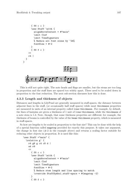
This is still not quite right. The note heads and flags are smaller, but the stems are too long<br />
in proportion and the staff lines are spaced too widely apart. These need to be scaled down in<br />
proportion to the font reduction. The next sub-section discusses how this is done.<br />
4.3.3 Length and thickness of objects<br />
Distances and lengths in <strong>LilyPond</strong> are generally measured in staff-spaces, the distance between<br />
adjacent lines in the staff, (or occasionally half staff spaces) while most thickness properties<br />
are measured in units of an internal property called line-thickness. For example, by default,<br />
the lines of hairpins are given a thickness of 1 unit of line-thickness, while the thickness of<br />
a note stem is 1.3. Note, though, that some thickness properties are different; for example, the<br />
thickness of beams is controlled by the value of the beam-thickness property, which is measured<br />
in staff-spaces.<br />
So how are lengths to be scaled in proportion to the font size? This can be done with the help<br />
of a special function called magstep provided for exactly this purpose. It takes one argument,<br />
the change in font size (#-2 in the example above) and returns a scaling factor suitable for<br />
reducing other objects in proportion. It is used like this:<br />
\new Staff ="main" {<br />
\relative g' {<br />
r4 g8 g c4 c8 d |<br />
e4 r8<br />