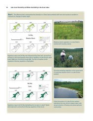
Statistical Analysis of Trends in the Red River Over a 45 Year Period
Statistical Analysis of Trends in the Red River Over a 45 Year Period
Statistical Analysis of Trends in the Red River Over a 45 Year Period

You also want an ePaper? Increase the reach of your titles
YUMPU automatically turns print PDFs into web optimized ePapers that Google loves.
SEAS Q represents seasonal variation with<strong>in</strong> <strong>the</strong> year;<br />
HF V Q represents high-frequency (short-term) variation.<br />
For a particular time (t, <strong>in</strong> decimal years);<br />
ANN Q = A5Y R + A1Y R “annual streamflow anomaly”<br />
A5YR is <strong>the</strong> average <strong>of</strong> log Q − M Q for five years up to and <strong>in</strong>clud<strong>in</strong>g time t (“5<br />
year streamflow anomaly”).<br />
A1YR is <strong>the</strong> average <strong>of</strong> log Q − M Q − A5Y R for one year up to and <strong>in</strong>clud<strong>in</strong>g<br />
time t (“1 year streamflow anomaly”).<br />
SEAS Q = A3M + AP ER<br />
A3M is <strong>the</strong> average <strong>of</strong> log Q − M Q − ANN Q for 3 months up to and <strong>in</strong>clud<strong>in</strong>g<br />
time t (“3 month streamflow anomaly”).<br />
APER = <strong>Period</strong>ic function <strong>of</strong> t with period 1-year.<br />
The top graph <strong>in</strong> Figure 4.1 depicts <strong>the</strong> daily streamflow at <strong>the</strong> Emerson monitor<strong>in</strong>g<br />
station while <strong>the</strong> bottom one depicts <strong>the</strong> streamflow by month. The two plots<br />
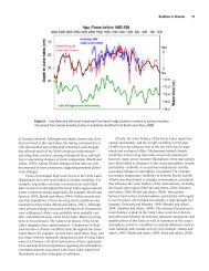
<strong>of</strong> dissolved calcium (Figure 4.2) show that sampl<strong>in</strong>g started <strong>in</strong> 1960 and ended <strong>in</strong><br />
2007. This range <strong>of</strong> data is most complete, <strong>the</strong>re are 47 years with at least 1 sample<br />
and an average <strong>of</strong> 16 samples per year, <strong>the</strong>reby mak<strong>in</strong>g enough data for time series<br />
analysis. Fur<strong>the</strong>r plots for <strong>the</strong> rema<strong>in</strong><strong>in</strong>g constituents are <strong>in</strong> <strong>the</strong> appendix.<br />
The program employs a periodic auto-regressive mov<strong>in</strong>g average model (PARMA<br />
model) to remove <strong>the</strong> “non-random” structure <strong>in</strong> <strong>the</strong> high-frequency variability<br />
<strong>of</strong> <strong>the</strong> streamflow. The result is a trend <strong>in</strong> <strong>the</strong> concentration data that reflects<br />
what <strong>the</strong> trend <strong>in</strong> <strong>the</strong> data would be if <strong>the</strong> variation due to <strong>the</strong> flow is m<strong>in</strong>imized.<br />
By exam<strong>in</strong><strong>in</strong>g <strong>the</strong> residuals <strong>of</strong> <strong>the</strong> flow adjusted concentrations possible monotonic<br />
trends can be seen. There are two complementary approaches for fitt<strong>in</strong>g trends<br />
(Vecchia, 2004). Exploratory trend analysis will provide <strong>the</strong> best statistical fit to <strong>the</strong><br />
data us<strong>in</strong>g generalized likelihood ratio tests. The second approach is an explanatory<br />
trend analysis which will use ancillary time-series data such as livestock data, to<br />
expla<strong>in</strong> <strong>the</strong> trends <strong>in</strong> concentration.<br />
30