Provisional Drogereit pdf
Provisional Drogereit pdf
Provisional Drogereit pdf

You also want an ePaper? Increase the reach of your titles
YUMPU automatically turns print PDFs into web optimized ePapers that Google loves.
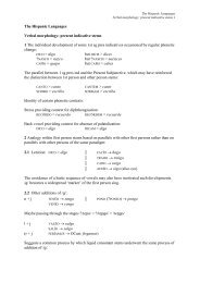
(p. 352), others with less spacing between letters and lines, show immaturity.<br />
However, there is no mistaking this handwriting compared with those of the other<br />
documents.<br />
This hand is stronger than that of Ae. C. The greater height and density of the letters<br />
give a restless impression, whereas the longer shafts and the seemingly reduced line<br />
spacing emphasise the vertical appearance. Highly characteristic are the high, open<br />
curves of the raised e. These resemble a bold swing of the quill, sometimes short, but<br />
with a strong downward curve. This makes the restlessness even more pronounced<br />
and the vertical effect more noticeable. Also, the individual letters are not formed or<br />
drawn out in a careful, even fashion, one beside the other. We encounter a change in<br />
the axis position of the individual letters within a word. The descenders constantly<br />
taper off. Ascenders and descenders frequently extend onto the next line. The result is<br />
a lively, structured script, given a firmness by the thickness of the letters.<br />
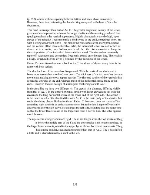
Eadm. C comes from the same school as Ae C; the shape of almost every letter is the<br />
same with both scribes.<br />
The slender form of the cross has disappeared. With the vertical bar shortened, it<br />
bears more resemblance to the Greek cross. The thickness of the two axes has become<br />
more even, making the cross appear heavier. The fine end strokes of the verticals thin<br />
somewhat upwards at the end, whereas those of the horizontal stroke bulge at the<br />
ends. However, there is no sign of a triangular thickening as with Ae. C.<br />
In the Acta line we have two different As. The capital A is plumper, differing visibly<br />
from that of Ae. C in the upper horizontal stroke with its up-curved end (as with the<br />
cross) and the long horizontal stroke at the lower end of the right side. The second A<br />
is the raised small a. We also find this with Ae. C in the main body of the charter, but<br />
not in the dating clause. Both raise the a 2 . Eadm. C, however, does not round off the<br />
ascending right stroke in as artistic a semicircle, but rather lets it taper off vertically<br />
downwards after the left curve. He enlarges the left side, rounding it at the same time<br />
so that the lower three strokes of the trapezium form a curved line. The letter appears<br />
much heavier.<br />
The Ego seems stronger and more rigid. The E has longer arms, the top stroke of the <br />
is below the middle arm of the E and the downstroke is no longer stretched, as<br />
the larger lower curve is joined to the upper by an almost horizontal centre axis. The <br />
has a more angular, squashed appearance than that of Ae.C. The o has shifted<br />
a little and is characterised by a slant to the left.<br />
352