i-m-a-g-i-n-efx-august

Create successful ePaper yourself
Turn your PDF publications into a flip-book with our unique Google optimized e-Paper software.
Workshops<br />
Core Skills: Part 6<br />
Manage colour<br />
tools in rebelle<br />
Martin Hanschild concludes his series on Rebelle by taking a look<br />
at working with the program’s colours tools and preset options<br />
Artist<br />
ProFile<br />
Martin<br />
Hanschild<br />
location:<br />
Czech Republic<br />
Martin is a 2D and 3D<br />
character designer<br />
who works in Prague for<br />
motion art house Eallin.<br />
www.hanschild.com<br />
When painting<br />
traditionally, you start<br />
with a limited set of<br />
colours, but you can<br />
achieve a full spectrum<br />
of hues by mixing them. In contrast,<br />
painting digitally gives you a full set<br />
of colours from the moment you<br />
select File>New, no mixing required.<br />
Sometimes it’s useful to adopt a<br />
traditional approach to digital art<br />
and begin a painting with only a<br />
specific set of colours. Rebelle’s Color<br />
Sets are a great tool here: they enable<br />
you to organise and store colours in<br />
a group, and also sort them by colour<br />
moods. This isn’t useful just to group<br />
your most commonly used colours. It<br />
also makes it straightforward to work<br />
with a limited range of hues – ideal<br />
for practice exercises (working just<br />
with shades of grey, brown and so<br />
on, for example) or painting specific<br />
situations where certain colours are<br />
dominant (dawn or dusk, say). And<br />
as you’d expect, Rebelle enables you<br />
to mix colours and create new hues,<br />
much as in traditional painting.<br />
One thing that Rebelle lacks when<br />
compared to other painting programs<br />
is advanced colour management<br />
options. However, you can now save<br />
your artwork as a PSD, enabling you<br />
to make final colour corrections<br />
(and, eventually, prepare for print) in<br />
Photoshop. In most respects Rebelle’s<br />
colour tools work in much the same<br />
way as other painting programs, as<br />
you’ll soon find out. I’ll also mention<br />
colour tracing of reference images,<br />
which is an interesting way to create<br />
a quick base for later work.<br />
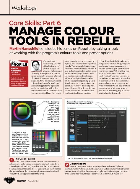
In the Color panel<br />
menu, you can<br />
turn on sliders<br />
and switch<br />
between RGB<br />
and HSL mode.<br />
If you want to<br />
tweak saturation<br />
or brightness<br />
while preserving<br />
the hue, use the<br />
HSL sliders.<br />
I use shortcuts mostly for changing<br />
Saturation and Brightness values.<br />
If you need to set a<br />
specific colour with a<br />
code number – using<br />
a colour’s Hex code for<br />
a website, say – click a<br />
colour in the upper left<br />
corner of the Color<br />
panel, and a new Select<br />
Color window appears<br />
with a System Color<br />
Palette. Now copy the<br />
colour code and click<br />
Add to Custom Colors.<br />
The Color Palette<br />
1<br />
In the Color Palette menu, you can choose between a<br />
colour wheel and a square colour palette (which is similar to<br />
Photoshop’s Color Picker). I prefer to use the circular palette,<br />
because it’s much faster to choose a colour. I can easily change<br />
the hue or choose the colour complementary to the selected<br />
colour from the opposite side of the circle.<br />
You can set the sensitivity of the adjustments in Preferences.<br />
Colour sliders<br />
2<br />
You can change HSL values by using either the slider or keyboard<br />
shortcuts. Go to Preferences>Keyboard>Color and set your own shortcuts for<br />
increase/decreasing Hue, Saturation and Lightness. Make sure you choose to<br />
apply this to HSL colour mode – otherwise, it’ll affect RGB values, too.<br />
84 August 2017