Journal of Film Preservation - FIAF
Journal of Film Preservation - FIAF
Journal of Film Preservation - FIAF

Create successful ePaper yourself
Turn your PDF publications into a flip-book with our unique Google optimized e-Paper software.
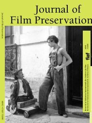
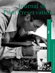
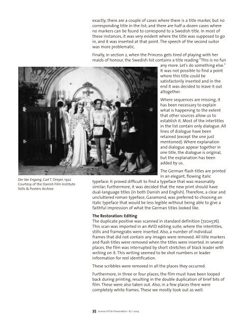
Der Var Engang, Carl T. Dreyer, 1922<br />
Courtesy <strong>of</strong> the Danish <strong>Film</strong> Institute<br />
Stills & Posters Archive<br />
exactly; there are a couple <strong>of</strong> cases where there is a title marker, but no<br />
corresponding title in the list; and there are half-a-dozen cases where<br />
no markers can be found to correspond to a Swedish title. In most <strong>of</strong><br />
these instances, it was very evident where the title was supposed to go<br />
in, and it was inserted at that point. The speech <strong>of</strong> the second suitor<br />
was more problematic.<br />
Finally, in section 2, when the Princess gets tired <strong>of</strong> playing with her<br />
maids <strong>of</strong> honour, the Swedish list contains a title reading “This is no fun<br />
any more. Let’s do something else.”<br />
It was not possible to find a point<br />
where this title could be<br />
satisfactorily inserted and in the<br />
end it was decided to leave it out<br />
altogether.<br />
Where sequences are missing, it<br />
has been necessary to explain<br />
what is happening to the extent<br />
that other sources allow us to<br />
establish it. Most <strong>of</strong> the intertitles<br />
in the list contain only dialogue. All<br />
lines <strong>of</strong> dialogue have been<br />
retained (except the one just<br />
mentioned). Where explanation<br />
and dialogue appear together in<br />
one title, the dialogue is original,<br />
but the explanation has been<br />
added by us.<br />
The German flash titles are printed<br />
in an elegant, flowing italic<br />
typeface. It proved difficult to find a typeface that was reasonably<br />
similar; furthermore, it was decided that the new print should have<br />
dual-language titles (in both Danish and English). Therefore, a clear and<br />
uncluttered roman typeface, Garamond, was preferred to choosing an<br />
italic typeface that would be less legible without being able to give a<br />
faithful impression <strong>of</strong> what the German titles looked like.<br />
The Restoration: Editing<br />
The duplicate positive was scanned in standard definition (720x576).<br />
This scan was imported in an AVID editing suite, where the intertitles,<br />
stills and framegrabs were inserted. Also, a number <strong>of</strong> individual<br />
frames that did not contain any images were removed. All title markers<br />
and flash titles were removed when the titles were inserted. In several<br />
places, the film was interrupted by short stretches <strong>of</strong> black leader with<br />
writing on it. This writing seemed to be shot numbers or leader<br />
information for reel identification.<br />
These scribbles were removed in all the places they occurred.<br />
Furthermore, in three or four places, the film must have been looped<br />
back during printing, resulting in the double duplication <strong>of</strong> brief bits <strong>of</strong><br />
film. These were also taken out. Also, in a few places there were<br />
completely white frames. These we mostly took out as well.<br />
35 <strong>Journal</strong> <strong>of</strong> <strong>Film</strong> <strong>Preservation</strong> / 67 / 2004