Why Bad Presentations Happen to Good Causes - The Goodman ...
Why Bad Presentations Happen to Good Causes - The Goodman ...
Why Bad Presentations Happen to Good Causes - The Goodman ...

You also want an ePaper? Increase the reach of your titles
YUMPU automatically turns print PDFs into web optimized ePapers that Google loves.
Design outside the (white) box.<br />
Most presentations I see use PowerPoint’s default white background for each slide.<br />
This projects the familiar white box on the screen, causing so many presentations <strong>to</strong><br />
look essentially the same. Even when presenters discover color backgrounds (or, heaven<br />
forefend, built-in templates), their images and text remain trapped inside a box.<br />
When you design slides with a black background, however, the<br />
LCD projec<strong>to</strong>r puts nothing on the screen except the images<br />
and text you choose. This allows you <strong>to</strong> create slides with<br />
no apparent borders while focusing the viewer’s attention<br />
precisely where you want it.<br />
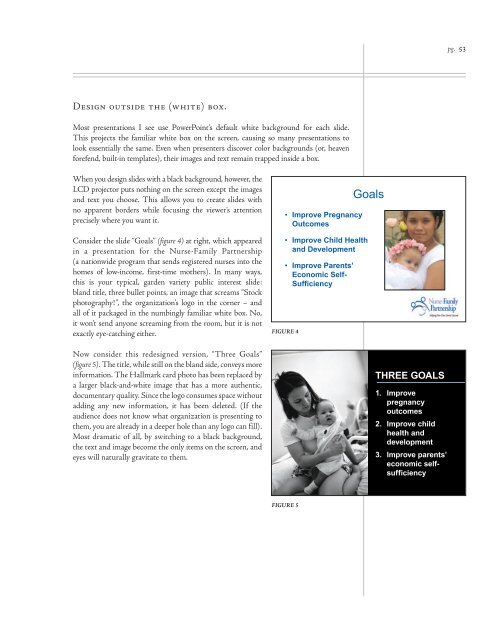
Consider the slide “Goals” (figure 4) at right, which appeared<br />
in a presentation for the Nurse-Family Partnership<br />
(a nationwide program that sends registered nurses in<strong>to</strong> the<br />
homes of low-income, first-time mothers). In many ways,<br />
this is your typical, garden variety public interest slide:<br />
bland title, three bullet points, an image that screams “S<strong>to</strong>ck<br />
pho<strong>to</strong>graphy!”, the organization’s logo in the corner – and<br />
all of it packaged in the numbingly familiar white box. No,<br />
it won’t send anyone screaming from the room, but it is not<br />
exactly eye-catching either.<br />
Now consider this redesigned version, “Three Goals”<br />
(figure 5). <strong>The</strong> title, while still on the bland side, conveys more<br />
information. <strong>The</strong> Hallmark card pho<strong>to</strong> has been replaced by<br />
a larger black-and-white image that has a more authentic,<br />
documentary quality. Since the logo consumes space without<br />
adding any new information, it has been deleted. (If the<br />
audience does not know what organization is presenting <strong>to</strong><br />
them, you are already in a deeper hole than any logo can fill).<br />
Most dramatic of all, by switching <strong>to</strong> a black background,<br />
the text and image become the only items on the screen, and<br />
eyes will naturally gravitate <strong>to</strong> them.<br />
• Improve Pregnancy<br />
Outcomes<br />
• Improve Child Health<br />
and Development<br />
• Improve Parents’<br />
Economic Self-<br />
Sufficiency<br />
FIGURE 4<br />
FIGURE 5<br />
Goals<br />
THREE GOALS<br />
1. Improve<br />
pregnancy<br />
outcomes<br />
2. Improve child<br />
health and<br />
development<br />
3. Improve parents’<br />
economic selfsufficiency<br />
pg. 53