Why Bad Presentations Happen to Good Causes - The Goodman ...
Why Bad Presentations Happen to Good Causes - The Goodman ...
Why Bad Presentations Happen to Good Causes - The Goodman ...

Create successful ePaper yourself
Turn your PDF publications into a flip-book with our unique Google optimized e-Paper software.
Unify elements <strong>to</strong> create a visual hierarchy.<br />
Like a well-designed print advertisement or billboard, a PowerPoint slide should capture<br />
attention like a s<strong>to</strong>p sign and direct it like a road map. Too often, however, the slides in<br />
nonprofit presentations are all over the road. <strong>The</strong>y may appear at a glance <strong>to</strong> have the<br />
minimum daily adult requirements – a title, bullet points, picture and caption – but the<br />
overall design does not tell the viewer where <strong>to</strong> look first, second, third, etc. <strong>The</strong>re is <strong>to</strong>o<br />
much visual clutter. And as a result, the eye wanders, then the mind wanders, then the<br />
viewer wanders right out of the room.<br />
“Clutter and confusion are failures of design, not necessarily the amount of information,”<br />
says Edward Tufte in his seminar, “Presenting Data and Information.” In many cases, by<br />
simply rearranging and visually prioritizing the same elements, a poorly designed slide can<br />
be transformed in<strong>to</strong> an eye-catching thing of beauty.<br />
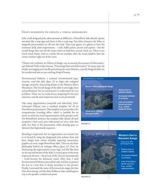
Environmental Defense, a national environmental organization,<br />
used this slide (figure 21) <strong>to</strong> depict the ecological<br />
damage caused by clearcutting forests in the Western Sierra<br />
Mountains. <strong>The</strong> overall design of the slide is seemingly clean<br />
and professional, but its visual power is undermined by two<br />
problems: <strong>The</strong>re are <strong>to</strong>o many items competing for the eye’s<br />
attention, and the most important item is not prioritized.<br />
Like many organizations (nonprofit and otherwise), Environmental<br />
Defense uses a standard template for all its<br />
PowerPoint presentations. This template was one product of a<br />
comprehensive branding effort, which is laudable for its<br />
intent <strong>to</strong> unify the visual representations of the group’s work.<br />
For PowerPoint, however, the template (like almost all such<br />
templates I have seen) puts information on every slide that<br />
adds very little <strong>to</strong> the presentation while denying space <strong>to</strong><br />
elements that legitimately require it.<br />
Branding is important, but an organization can remain true<br />
<strong>to</strong> its brand by using the designated color palette, font, and<br />
basic design style without slavishly imposing unnecessary<br />
graphics on every single PowerPoint slide. This was the basic<br />
philosophy behind my redesign efforts (figure 22). First, by<br />
eliminating the organization’s name, logo, and the blue bars<br />
on the <strong>to</strong>p and bot<strong>to</strong>m of the slide, I created space so the most<br />
important element – the picture of the clearcut mountainside<br />
– could become the dominant visual. After that, I used<br />
Environmental Defense’s prescribed color and font <strong>to</strong> present<br />
the text in a box that is clearly secondary <strong>to</strong> the picture.<br />
Finally, I animated the name of the mountain range, the date<br />
of its clearcutting, and the three bullets so they would appear<br />
only as the speaker reached each point.<br />
<br />
<br />
<br />
<br />
FIGURE 21<br />
FIGURE 22<br />
<br />
<br />
<br />
<br />
<br />
<br />
<br />
<br />
pg. 61