Why Bad Presentations Happen to Good Causes - The Goodman ...
Why Bad Presentations Happen to Good Causes - The Goodman ...
Why Bad Presentations Happen to Good Causes - The Goodman ...

Create successful ePaper yourself
Turn your PDF publications into a flip-book with our unique Google optimized e-Paper software.
pg. 54<br />
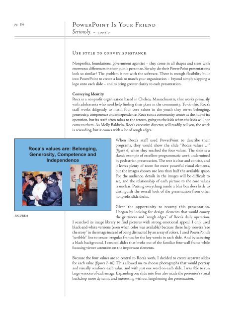
FIGURE 6<br />
Roca’s values are: Belonging,<br />
Generosity, Competence and<br />
Independence<br />
PowerPoint Is Your Friend<br />
Seriously. – cont’d<br />
Use style <strong>to</strong> convey substance.<br />
Nonprofits, foundations, government agencies – they come in all shapes and sizes with<br />
enormous differences in their public personae. So why do their PowerPoint presentations<br />
look so similar? <strong>The</strong> problem is not with the software. <strong>The</strong>re is enough flexibility built<br />
in<strong>to</strong> PowerPoint <strong>to</strong> create a look <strong>to</strong> match your organization – beyond simply slapping a<br />
logo on<strong>to</strong> each slide – and <strong>to</strong> bring greater clarity <strong>to</strong> each presentation.<br />
Conveying Identity<br />
Roca is a nonprofit organization based in Chelsea, Massachusetts, that works primarily<br />
with adolescents who need help finding their place in the community. To do this, Roca’s<br />
staff works diligently <strong>to</strong> instill four core values in the youth they serve: belonging,<br />
generosity, competence and independence. Roca runs a community center as the hub of its<br />
operation, but its staff often takes <strong>to</strong> the streets, going <strong>to</strong> the kids when the kids will not<br />
come <strong>to</strong> them. As Molly Baldwin, Roca’s executive direc<strong>to</strong>r, will readily tell you, the work<br />
is rewarding, but it comes with a lot of rough edges.<br />
When Roca’s staff used PowerPoint <strong>to</strong> describe their<br />
programs, they would show the slide “Roca’s values …”<br />
(figure 6) when they reached the four values. <strong>The</strong> slide is a<br />
classic example of excellent programmatic work undermined<br />
by pedestrian presentation. <strong>The</strong> text is clear and concise, and<br />
it leaves plenty of room for more powerful visual elements,<br />
but the images chosen use less than half the available space.<br />
For the audience, details in the images will be difficult <strong>to</strong><br />
see, and the relationship of each picture <strong>to</strong> the core values<br />
is unclear. Putting everything inside a blue box does little <strong>to</strong><br />
distinguish the overall look of the presentation from other<br />
nonprofit slide decks.<br />
Given the opportunity <strong>to</strong> revamp this presentation,<br />
I began by looking for design elements that would convey<br />
the grittiness and “rough edges” of Roca’s daily operation.<br />
I searched its image library <strong>to</strong> find pictures with strong emotional appeal. I only used<br />
black-and-white versions (even when color was available) because these help viewers “see<br />
the s<strong>to</strong>ry” in the image instead of being distracted by an array of colors. I used PowerPoint’s<br />
“scribble” line <strong>to</strong> create irregular frames for the key words in each slide. And by selecting<br />
a black background, I created slides that broke out of the familiar four-wall frame while<br />
focusing viewer attention on the important elements.<br />
Because the four values are so central <strong>to</strong> Roca’s work, I decided <strong>to</strong> create separate slides<br />
for each value (figures 7–10). This allowed me <strong>to</strong> choose pho<strong>to</strong>graphs that would portray<br />
and visually reinforce each value, and with just one word on each slide, I was able <strong>to</strong> run<br />
large versions of each image. Expanding one slide in<strong>to</strong> four also made the presenter’s visual<br />
backdrop more dynamic and interesting without lengthening the presentation.