Successful transport decision-making - Osmose
Successful transport decision-making - Osmose
Successful transport decision-making - Osmose

Create successful ePaper yourself
Turn your PDF publications into a flip-book with our unique Google optimized e-Paper software.
Vol 2 - Table of Contents Next Practical information<br />
Who participates and how?<br />
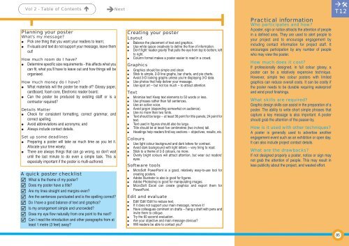
Planning your poster<br />
What’s my message?<br />
Pick one thing that you want your readers to learn;<br />
If visuals and text do not support your message, leave them<br />
out!<br />
How much room do I have?<br />
Determine specific size requirements - this affects what you<br />
can fit, what you’ll have to leave out and how things will be<br />
organised.<br />
How much money do I have?<br />
What materials will the poster be made of? Glossy paper,<br />
cardboard, foam core, Electronic reader board;<br />
Can the poster be produced by existing staff or is a<br />
contractor required?<br />
Details Matter<br />
Check for consistent formatting, correct grammar, and<br />
correct spelling;<br />
Avoid abbreviations and acronyms; and<br />
Always include contact details.<br />
Set up some deadlines<br />
Preparing a poster will take as much time as you let it.<br />
Allocate your time wisely;<br />
There are always things that can go wrong, so don’t wait<br />
until the last minute to do even a simple task. This is<br />
especially important if the poster is multi-authored.<br />
A quick poster checklist<br />
What is the theme of my poster?<br />
Does my poster have a title?<br />
Are my lines straight and margins even?<br />
Are the sentences punctuated and is the spelling correct?<br />
Do I have a good balance of text and graphics?<br />
Is my arrangement simple and uncrowded?<br />
Does my eye flow naturally from one point to the next?<br />
Can I read the introduction and other paragraphs from at<br />
least 1 metre (3 feet) away?<br />
Creating your poster<br />
Layout<br />
Balance the placement of text and graphics.<br />
Use white space creatively to define the flow of information.<br />
Don’t fight ‘reader gravity’ that pulls the eye from top to bottom, left<br />
to right.<br />
Column format makes a poster easier to read in a crowd.<br />
Graphics<br />
Graphics should be simple and clean.<br />
Stick to simple, 2-D line graphs, bar charts, and pie charts.<br />
Avoid 3-D looking graphs unless you're displaying 3-D data.<br />
Use photos that help deliver your message.<br />
Use spot art -- but not too much -- to attract attention.<br />
Text<br />
Minimise text! Keep text elements to 50 words or less.<br />
Use phrases rather than full sentences.<br />
Use an active voice.<br />
Avoid jargon (depending somewhat on audience).<br />
Use no more than two fonts.<br />
Text should be large -- at least 36 point for title panels; 24 point for<br />
text.<br />
Text used in figures should also be large.<br />
Title should be at least five centimetres (two inches) tall.<br />
Headings help readers find key sections -- objectives, results, etc.<br />
Colours<br />
Use light colour background and dark letters for contrast.<br />
Avoid dark background with light letters -- very tiring to read.<br />
Stick to a theme of 2-3 colours, no more.<br />
Overly bright colours will attract attention, but wear out readers'<br />
eyes.<br />
Software tools<br />
MicroSoft PowerPoint is a good, relatively easy-to-use tool for<br />
creating posters.<br />
Adobe Illustrator is also is good for figures.<br />
Adobe Photoshop is good for manipulating images.<br />
MicroSoft Excel can create graphics and export them for<br />
PowerPoint.<br />
Edit and evaluate<br />
Edit! Edit! Edit! to reduce text.<br />
If it does not support your main message, remove it!<br />
Have colleagues comment on drafts -- hang a draft with pens and<br />
invite them to critique.<br />
Try the 60 second evaluation.<br />
Are your objective and main message obvious?<br />
Will readers be able to contact you?<br />
A poster, sign or notice attracts the attention of people<br />
in a defined area. They are used to alert people to<br />
your project and to encourage engagement by<br />
including contact information for project staff. It<br />
encourages participation by any number of people<br />
who may view the poster.<br />
How much does it cost?<br />
If professionally designed, in full colour glossy, a<br />
poster can be a relatively expensive technique.<br />
However, simple two colour posters with limited<br />
graphics can reduce overall costs. It can be costly if<br />
the poster needs to be durable requiring waterproof<br />
and wind proof finishings.<br />
What skills are required?<br />
Graphic design skills can assist in the preparation of a<br />
poster. The ability to write short simple phrases that<br />
capture a key message is also important. A poster<br />
should grab the attention of the passer-by.<br />
How is it used with other techniques?<br />
A poster is generally used to advertise another<br />
engagement event such as an exhibition or open day.<br />
It can also include project contact details.<br />
What are the drawbacks?<br />
If not designed properly a poster, notice or sign may<br />
not grab the attention of people. This may result in<br />
less publicity about the project, and wasted effort.<br />
<br />
T12<br />
85