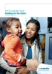
Visual Identity Standards PDF v.3 - The Co-operative
Visual Identity Standards PDF v.3 - The Co-operative
Visual Identity Standards PDF v.3 - The Co-operative

Create successful ePaper yourself
Turn your PDF publications into a flip-book with our unique Google optimized e-Paper software.
How our name and our logotype work within text:<br />
general rules.<br />
<strong>The</strong> <strong>Co</strong>-<strong>operative</strong> logotype should not be used within body text. However,<br />
the logotype can be positioned to start a headline or at the beginning of the<br />
first line of a paragraph.<br />
<strong>The</strong> body text form uses an upper case ‘T’ and an upper case ‘C’<br />
(<strong>The</strong> <strong>Co</strong>-<strong>operative</strong>).<br />
<strong>The</strong> text form must always be presented in the same style and colour as the<br />
text it is written in.<br />
Every effort should be made to use the body text form at the beginning<br />
of a sentence.<br />
For example:<br />
<strong>The</strong> <strong>Co</strong>-<strong>operative</strong> has almost 3,000 food stores, with the primary aim<br />
of meeting the shopping needs of the community.<br />
Body text form with business descriptor.<br />
When the text form is followed by a business descriptor, the first letter of the<br />
business descriptor is always written in upper case. <strong>The</strong> business descriptor<br />
should not appear in its brand colour. Instead, it should appear in the same<br />
style and colour as the text it is written into.<br />
For example:<br />
<strong>The</strong> <strong>Co</strong>-<strong>operative</strong> Travel stands out in the marketplace as a consumer champion.<br />
Body text form with location descriptor.<br />
When the text form is followed by a location descriptor (eg: Laurencekirk),<br />
the first letter(s) of the location descriptor are always written in upper case.<br />
<strong>The</strong> location descriptor should not appear in its brand colour. Instead, it should<br />
appear in the same style and colour as the text it is written into.<br />
For example:<br />
<strong>The</strong> <strong>Co</strong>-<strong>operative</strong> Laurencekirk brings a new level of convenience shopping.<br />
<strong>The</strong> <strong>Co</strong>-<strong>operative</strong> north Ferriby serves its local community.<br />
<strong>The</strong> <strong>Co</strong>-<strong>operative</strong> logotype<br />
Society names.<br />
When referring to co-<strong>operative</strong> in a society’s name the word ‘<strong>Co</strong>-<strong>operative</strong>’<br />
should feature an upper case ‘C’.<br />
For example:<br />
<strong>The</strong> Midcounties <strong>Co</strong>-<strong>operative</strong> Society<br />
<strong>The</strong> <strong>Co</strong>-<strong>operative</strong> Movement.<br />
When referring to the <strong>Co</strong>-<strong>operative</strong> Movement only use an upper case ‘T’ at the<br />
beginning of a sentence. Throughout body copy use a lower case ‘t’.<br />
For example:<br />
<strong>The</strong> <strong>Co</strong>-<strong>operative</strong> Movement piloted a new brand identity in 2005.<br />
During 2005 the <strong>Co</strong>-<strong>operative</strong> Movement piloted a new brand identity.<br />
45