Visual Identity Standards PDF v.3 - The Co-operative
Visual Identity Standards PDF v.3 - The Co-operative
Visual Identity Standards PDF v.3 - The Co-operative
Create successful ePaper yourself
Turn your PDF publications into a flip-book with our unique Google optimized e-Paper software.
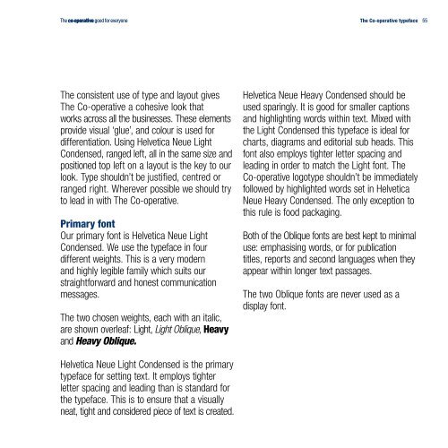
<strong>The</strong> consistent use of type and layout gives<br />
<strong>The</strong> <strong>Co</strong>-<strong>operative</strong> a cohesive look that<br />
works across all the businesses. <strong>The</strong>se elements<br />
provide visual ‘glue’, and colour is used for<br />
differentiation. Using Helvetica Neue Light<br />
<strong>Co</strong>ndensed, ranged left, all in the same size and<br />
positioned top left on a layout is the key to our<br />
look. Type shouldn’t be justified, centred or<br />
ranged right. Wherever possible we should try<br />
to lead in with <strong>The</strong> <strong>Co</strong>-<strong>operative</strong>.<br />
Primary font<br />
Our primary font is Helvetica Neue Light<br />
<strong>Co</strong>ndensed. We use the typeface in four<br />
different weights. This is a very modern<br />
and highly legible family which suits our<br />
straightforward and honest communication<br />
messages.<br />
<strong>The</strong> two chosen weights, each with an italic,<br />
are shown overleaf: Light, Light Oblique, Heavy<br />
and Heavy Oblique.<br />
Helvetica Neue Light <strong>Co</strong>ndensed is the primary<br />
typeface for setting text. It employs tighter<br />
letter spacing and leading than is standard for<br />
the typeface. This is to ensure that a visually<br />
neat, tight and considered piece of text is created.<br />
<strong>The</strong> <strong>Co</strong>-<strong>operative</strong> typeface<br />
Helvetica Neue Heavy <strong>Co</strong>ndensed should be<br />
used sparingly. It is good for smaller captions<br />
and highlighting words within text. Mixed with<br />
the Light <strong>Co</strong>ndensed this typeface is ideal for<br />
charts, diagrams and editorial sub heads. This<br />
font also employs tighter letter spacing and<br />
leading in order to match the Light font. <strong>The</strong><br />
<strong>Co</strong>-<strong>operative</strong> logotype shouldn’t be immediately<br />
followed by highlighted words set in Helvetica<br />
Neue Heavy <strong>Co</strong>ndensed. <strong>The</strong> only exception to<br />
this rule is food packaging.<br />
Both of the Oblique fonts are best kept to minimal<br />
use: emphasising words, or for publication<br />
titles, reports and second languages when they<br />
appear within longer text passages.<br />
<strong>The</strong> two Oblique fonts are never used as a<br />
display font.<br />
55


