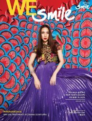
WE Smile Magazine June 2015
The In-Flight Magazine of Thai Smile Airways
The In-Flight Magazine of Thai Smile Airways

You also want an ePaper? Increase the reach of your titles
YUMPU automatically turns print PDFs into web optimized ePapers that Google loves.
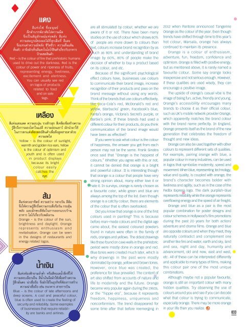
แดง<br />
สีแห่งไฟ ซึ่งมนุษย์<br />
ดึกดำบรรพ์อาศัยไล่ความมืด<br />
จึงเป็นสัญลักษณ์แห่งพลัง สีแห่ง<br />
ความสมบูรณ์ของผลไม้ที่สุกเต็มที่ สีแดง<br />
จึงแทนค่าความมีพลัง ชีวิตชีวา ความตื่นเต้น<br />
ตื่นตัว เราจึงมักเห็นสีแดงในโลโก้สินค้าเกี่ยวกับอาหาร<br />
ป้ายเซลสินค้า<br />
Red – is the colour of fire that prehistoric humans<br />
used to drive out the darkness. Red is the<br />
colour of power and ripeness of fruits,<br />
representing energy, liveliness,<br />
excitement and alertness.<br />
You can usually see red<br />
on logos of products<br />
related to food<br />
and on sale<br />
tags.<br />
เหลือง<br />
สีแห่งแสงแดด ความอบอุ่น รวงข้าวสุก สีเหลืองจึงสร้างความ<br />
รู ้สึกถึงการมองโลกในแง่ดี ความอ่อนเยาว์ มักนำมาใช้<br />
ในการตกแต่งดิสเพลย์สินค้าเพื ่อดึงดูดสายตาด้วย<br />
ความสดใส<br />
Yellow - is the colour of sunlight,<br />
warmth and golden rice ears. Yellow<br />
is the colour of optimism and<br />
youth and is often used<br />
in product displays<br />
because its bright<br />
colour easily<br />
catches the<br />
eye.<br />
ส้ม<br />
สีแห่งดวงอาทิตย์ ความสว่าง กลางวัน สีส้ม<br />
จึงให้ความรู้สึกถึงความกระตือรือร้น กระตุ้น<br />
พลัง และมักพบสีส้มในการออกแบบร้าน<br />
อาหาร โลโก้เกี่ยวกับพลังงาน<br />
Orange - is the colour of the sun,<br />
brightness and daylight. Orange<br />
represents enthusiasm and<br />
revitalisation. Orange can be seen<br />
in the designs of restaurants and<br />
energy related logos.<br />
น้ำเงิน<br />
สีแห่งท้องฟ้ายามย่ำค่ำ หรือสีทะเลน้ำลึกที่ให้<br />
ความสงบเยือกเย็น สีน้ำเงินจึงมักใช้เพื่อสร้างความ<br />
รู้สึกมั่นคง น่าเชื่อถือ จึงมักใช้ในธุรกิจที่ต้องการสร้าง<br />
ความน่าเชื่อถือ เช่น ธนาคาร สายการบิน<br />
Blue – is the colour of late afternoons and<br />
deep oceans. A cool and peaceful colour,<br />
blue is often used to create the feeling of<br />
security and reliability. Some examples<br />
of businesses that require reliability<br />
are banks and airlines.<br />
are all stimulated by colour, whether we are<br />
aware of it or not. There have been many<br />
studies on the use of colour which shows 60%<br />
of people are more drawn to colours than<br />
text, colours increase brand recognition by as<br />
much as 80% and understanding of brand<br />
image by 60%, 80% of people make the<br />
decision of whether to buy a product based<br />
on its colour, and etc.<br />
Because of the significant psychological<br />
effect colours have, businesses use colours<br />
to communicate their brand image, increase<br />
recognition of their products and pass on the<br />
brand message without using any words.<br />
Think of the brands that use colours effectively,<br />
like Coca-Cola’s red, McDonald’s red and<br />
yellow, Starbucks’ green, Facebook’s blue,<br />
Fanta’s orange, Victoria’s Secret’s purple, or<br />
Barbie’s pink. If these brands had used a<br />
different colour for their products, do you think<br />
communication of the brand image would<br />
have been as effective?<br />
If you were to ask what colour is the colour<br />
of happiness, the answer you get from each<br />
person may not be the same. Frank Sinatra<br />
once said that “Orange is the happiest of<br />
colours.” Whether you agree with this or not,<br />
it cannot be denied that orange is a bright<br />
and powerful colour. It is interesting though<br />
that orange is a colour that people have very<br />
strong opinion about, many either love it or<br />
hate it. In surveys, orange is rarely chosen as<br />
a favourite color, while green and blue are<br />
always among the top of the list. Even though<br />
orange is a catchy colour, there are elements<br />
of the colour that is often overlooked.<br />
Did you know that orange is one of the first<br />
colours used in painting? This is because<br />
before man-made colours and the digital age<br />
came about, the easiest coloured powders<br />
found in nature were often in the family of<br />
reds, oranges and yellows. The oldest drawings<br />
like those found on cave walls in the prehistoric<br />
period were mostly done in orange and red.<br />
Blue tones were created much later, which is<br />
why drawings in the past were mostly<br />
dominated by orange, yellow and brown tones.<br />
However, once blue was created, the<br />
preference for blue prevailed. The content of<br />
art also shifted from accounts of nature and<br />
life to modernity and the future. Orange<br />
became very popular again during the 1960s,<br />
or the “hippie era”, because it represents<br />
freedom, happiness, uniqueness and<br />
nonconformism. The trend disappeared for<br />
some time after that before reemerging in<br />
2012 when Pantone announced Tangerine<br />
Orange as the colour of the year. Even though<br />
trends have shifted through time to this year’s<br />
hot colour, Marsala, orange has always<br />
continued to maintain its presence.<br />
Orange is a colour of enthusiasm,<br />
adventure, fun, freedom, confidence and<br />
optimism. Orange is filled with positive energy,<br />
but as mentioned above, it is rarely named a<br />
favourite colour. Some say orange looks<br />
inexpensive and not serious enough. However,<br />
if these qualities are used wisely, they can<br />
encourage a positive image.<br />
The upside of orange’s casual vibe is the<br />
image of being fun, active, friendly and young.<br />
Orange’s accessibility encourages many<br />
brands to choose it as their official colour,<br />
such as UK’s mobile network provider Orange,<br />
which apparently matches the brand colour<br />
with the brand name perfectly. In England,<br />
Orange presents itself as the brand of the new<br />
generation that celebrates the freedom of<br />
thought and new ideas.<br />
Orange can also be used together with other<br />
colours to represent different sets of qualities.<br />
For example, pairing orange with blue, a<br />
popular colour in many industries, can be used<br />
in logos that symbolize modernity, speed and<br />
movement. When blue, representing technology,<br />
value and quality, is coupled with orange, the<br />
brand’s character becomes bolder with<br />
liveliness and agility, such as in the case of the<br />
FedEx Express logo. The dark purplish-blue<br />
represents reliability while the orange represents<br />
overflowing energy and the speed of air freight.<br />
Orange and blue as a pair is the most<br />
popular combination for poster designs and<br />
colour schemes in Hollywood’s film promotions<br />
during the past 20 years for both action/<br />
adventure and drama films. Orange and blue<br />
are opposite colours and when they meet, they<br />
naturally contradict and complement one<br />
another like fire and water, earth and sky, land<br />
and sea, night and day, humanity and<br />
advancement, old and new, east and west,<br />
etc. All of these can be interpreted differently<br />
and applicable to many types of films, making<br />
this colour pair one of the most unique<br />
combinations.<br />
Although maybe not a popular favourite,<br />
orange is still an important colour with many<br />
hidden qualities. Try observing the use of<br />
colours around you and see if you can decode<br />
what that colour is trying to communicate,<br />
especially orange. There may be more orange<br />
in your life than you realize.<br />
033