

design3

You also want an ePaper? Increase the reach of your titles
YUMPU automatically turns print PDFs into web optimized ePapers that Google loves.
98<br />
The Principles of Beautiful Web Design<br />
Light and Shadow<br />
Light and shadow are the most important visual cues we can use to determine or create depth and<br />
volume in compositions. Even with accurate perspective and proportion, a composition without<br />
highlights and shadowing will look flat. Light and shadow establish visual contrast, and help to<br />
create the illusion of three-dimensional depth with two-dimensional media, such as pencil on paper<br />
or pixels on your computer screen. Light and shadow alone can also be used to make two-dimensional<br />
objects look like they exist in three-dimensional space.<br />
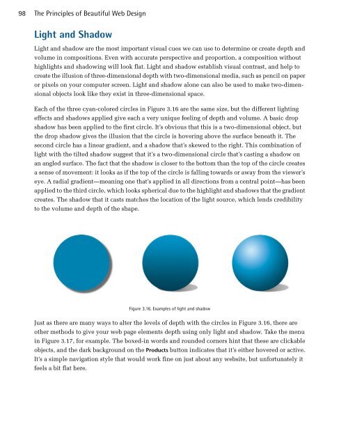
Each of the three cyan-colored circles in Figure 3.16 are the same size, but the different lighting<br />
effects and shadows applied give each a very unique feeling of depth and volume. A basic drop<br />
shadow has been applied to the first circle. It’s obvious that this is a two-dimensional object, but<br />
the drop shadow gives the illusion that the circle is hovering above the surface beneath it. The<br />
second circle has a linear gradient, and a shadow that’s skewed to the right. This combination of<br />
light with the tilted shadow suggest that it’s a two-dimensional circle that’s casting a shadow on<br />
an angled surface. The fact that the shadow is closer to the bottom than the top of the circle creates<br />
a sense of movement: it looks as if the top of the circle is falling towards or away from the viewer’s<br />
eye. A radial gradient—meaning one that’s applied in all directions from a central point—has been<br />
applied to the third circle, which looks spherical due to the highlight and shadows that the gradient<br />
creates. The shadow that it casts matches the location of the light source, which lends credibility<br />
to the volume and depth of the shape.<br />
Figure 3.16. Examples of light and shadow<br />
Just as there are many ways to alter the levels of depth with the circles in Figure 3.16, there are<br />
other methods to give your web page elements depth using only light and shadow. Take the menu<br />
in Figure 3.17, for example. The boxed-in words and rounded corners hint that these are clickable<br />
objects, and the dark background on the Products button indicates that it’s either hovered or active.<br />
It’s a simple navigation style that would work fine on just about any website, but unfortunately it<br />
feels a bit flat here.