

design3

You also want an ePaper? Increase the reach of your titles
YUMPU automatically turns print PDFs into web optimized ePapers that Google loves.
Layout and Composition<br />
43<br />
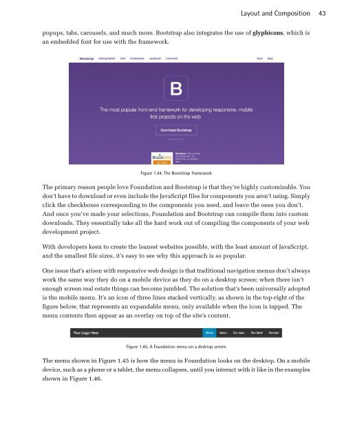
popups, tabs, carousels, and much more. Bootstrap also integrates the use of glyphicons, which is<br />
an embedded font for use with the framework.<br />
Figure 1.44. The Bootstrap framework<br />
The primary reason people love Foundation and Bootstrap is that they’re highly customizable. You<br />
don’t have to download or even include the JavaScript files for components you aren’t using. Simply<br />
click the checkboxes corresponding to the components you need, and leave the ones you don’t.<br />
And once you’ve made your selections, Foundation and Bootstrap can compile them into custom<br />
downloads. They essentially take all the hard work out of compiling the components of your web<br />
development project.<br />
With developers keen to create the leanest websites possible, with the least amount of JavaScript,<br />
and the smallest file sizes, it’s easy to see why this approach is so popular.<br />
One issue that’s arisen with responsive web design is that traditional navigation menus don’t always<br />
work the same way they do on a mobile device as they do on a desktop screen; when there isn’t<br />
enough screen real estate things can become jumbled. The solution that’s been universally adopted<br />
is the mobile menu. It’s an icon of three lines stacked vertically, as shown in the top-right of the<br />
figure below, that represents an expandable menu, only available when the icon is tapped. The<br />
menu contents then appear as an overlay on top of the site’s content.<br />
Figure 1.45. A Foundation menu on a desktop screen<br />
The menu shown in Figure 1.45 is how the menu in Foundation looks on the desktop. On a mobile<br />
device, such as a phone or a tablet, the menu collapses, until you interact with it like in the examples<br />
shown in Figure 1.46.
 Change language