

design3

Create successful ePaper yourself
Turn your PDF publications into a flip-book with our unique Google optimized e-Paper software.
Layout and Composition<br />
23<br />
from left to right (remember that many languages, like Hebrew and Arabic, are read from right to<br />
left) and scan a page from top to bottom.<br />
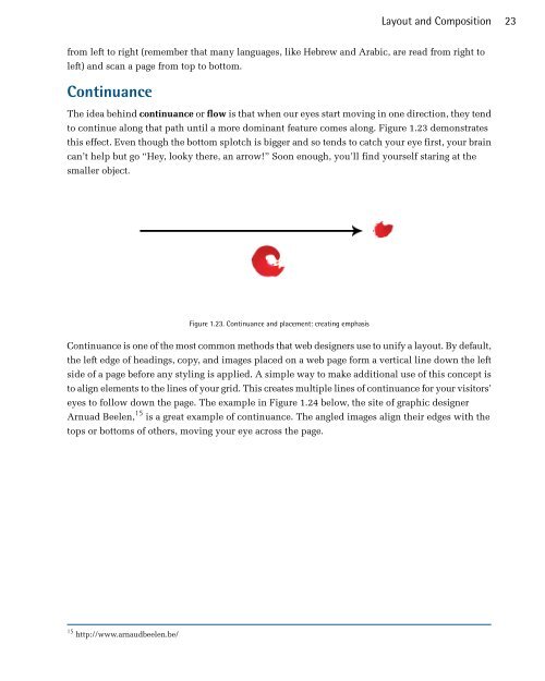
Continuance<br />
The idea behind continuance or flow is that when our eyes start moving in one direction, they tend<br />
to continue along that path until a more dominant feature comes along. Figure 1.23 demonstrates<br />
this effect. Even though the bottom splotch is bigger and so tends to catch your eye first, your brain<br />
can’t help but go “Hey, looky there, an arrow!” Soon enough, you’ll find yourself staring at the<br />
smaller object.<br />
Figure 1.23. Continuance and placement: creating emphasis<br />
Continuance is one of the most common methods that web designers use to unify a layout. By default,<br />
the left edge of headings, copy, and images placed on a web page form a vertical line down the left<br />
side of a page before any styling is applied. A simple way to make additional use of this concept is<br />
to align elements to the lines of your grid. This creates multiple lines of continuance for your visitors’<br />
eyes to follow down the page. The example in Figure 1.24 below, the site of graphic designer<br />
Arnuad Beelen, 15 is a great example of continuance. The angled images align their edges with the<br />
tops or bottoms of others, moving your eye across the page.<br />
15 http://www.arnaudbeelen.be/