

design3

Create successful ePaper yourself
Turn your PDF publications into a flip-book with our unique Google optimized e-Paper software.
Layout and Composition<br />
25<br />
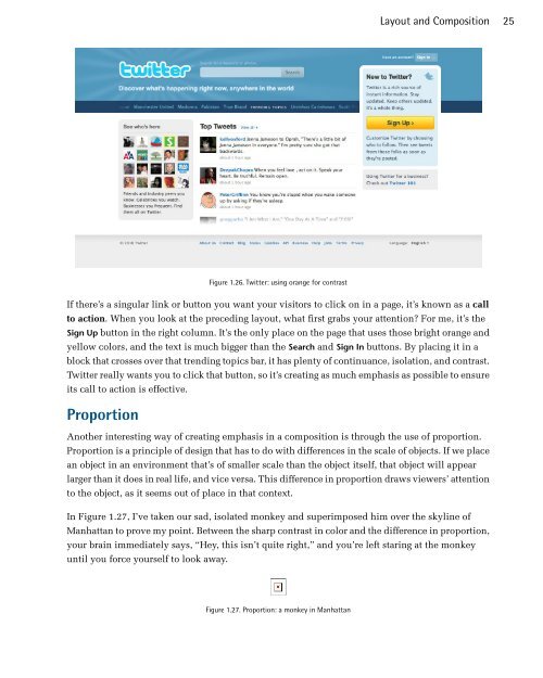
Figure 1.26. Twitter: using orange for contrast<br />
If there’s a singular link or button you want your visitors to click on in a page, it’s known as a call<br />
to action. When you look at the preceding layout, what first grabs your attention? For me, it’s the<br />
Sign Up button in the right column. It’s the only place on the page that uses those bright orange and<br />
yellow colors, and the text is much bigger than the Search and Sign In buttons. By placing it in a<br />
block that crosses over that trending topics bar, it has plenty of continuance, isolation, and contrast.<br />
Twitter really wants you to click that button, so it’s creating as much emphasis as possible to ensure<br />
its call to action is effective.<br />
Proportion<br />
Another interesting way of creating emphasis in a composition is through the use of proportion.<br />
Proportion is a principle of design that has to do with differences in the scale of objects. If we place<br />
an object in an environment that’s of smaller scale than the object itself, that object will appear<br />
larger than it does in real life, and vice versa. This difference in proportion draws viewers’ attention<br />
to the object, as it seems out of place in that context.<br />
In Figure 1.27, I’ve taken our sad, isolated monkey and superimposed him over the skyline of<br />
Manhattan to prove my point. Between the sharp contrast in color and the difference in proportion,<br />
your brain immediately says, “Hey, this isn’t quite right,” and you’re left staring at the monkey<br />
until you force yourself to look away.<br />
Figure 1.27. Proportion: a monkey in Manhattan