

design3

You also want an ePaper? Increase the reach of your titles
YUMPU automatically turns print PDFs into web optimized ePapers that Google loves.
Texture<br />
99<br />
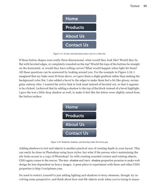
Figure 3.17. A clear and functional menu—but it’s a little flat<br />
If these button shapes were really three-dimensional, what would they look like? Would they be<br />
flat with beveled edges, or completely rounded on the top? Would the tops of the buttons be straight<br />
on the horizontal, or would they have rolling curves? What would happen when light hit them?<br />
All these questions can be answered by looking around you. For the example in Figure 3.18, I<br />
imagined that my links were lit from above, so I gave them a slight gradient rather than making the<br />
background color flat. I also added a bevel to the edges to make them feel a bit like glossy, rectangular<br />
subway tiles. I wanted the active link to look inset instead of beveled out, so that it appears<br />
to be clicked. I achieved that by adding a shadow to the top of the block instead of a bevel highlight.<br />
I gave the text a little drop shadow as well, to make it feel like the letters were slightly raised from<br />
the button surface.<br />
Figure 3.18. Gradients, shadows, and beveling make this menu pop<br />
Adding shadows to text and objects is another practical way of creating depth in your layout. This<br />
can easily be done in Photoshop using layer styles, but what if the person who’s maintaining the<br />
site lacks access to a copy of Photoshop? As with creating rounded corners and rotating objects,<br />
CSS3 again comes to the rescue. The box-shadow and text-shadow properties promise to make web<br />
design far less dependent on heavy images. A great place to experiment with these and other CSS3<br />
properties is http://css3please.com.<br />
No need to restrict yourself to just adding lighting and shadows to boxy elements, though: try involving<br />
some perspective, and think about how real-life objects work when you’re trying to manu-
 Change language