

design3

You also want an ePaper? Increase the reach of your titles
YUMPU automatically turns print PDFs into web optimized ePapers that Google loves.
116<br />
The Principles of Beautiful Web Design<br />
Application: Logo and Content<br />
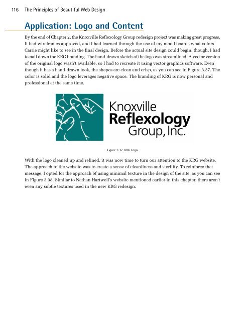
By the end of Chapter 2, the Knoxville Reflexology Group redesign project was making great progress.<br />
It had wireframes approved, and I had learned through the use of my mood boards what colors<br />
Carrie might like to see in the final design. Before the actual site design could begin, though, I had<br />
to nail down the KRG branding. The hand-drawn sketch of the logo was streamlined. A vector version<br />
of the original logo wasn't available, so I had to recreate it using vector graphics software. Even<br />
though it has a hand-drawn look, the shapes are clean and crisp, as you can see in Figure 3.37. The<br />
color is solid and the logo leverages negative space. The branding of KRG is now personal and<br />
professional at the same time.<br />
Figure 3.37. KRG Logo<br />
With the logo cleaned up and refined, it was now time to turn our attention to the KRG website.<br />
The approach to the website was to create a sense of cleanliness and sterility. To reinforce that<br />
message, I opted for the approach of using minimal texture in the design of the site, as you can see<br />
in Figure 3.38. Similar to Nathan Hartwell's website mentioned earlier in this chapter, there aren't<br />
even any subtle textures used in the new KRG redesign.