

design3

You also want an ePaper? Increase the reach of your titles
YUMPU automatically turns print PDFs into web optimized ePapers that Google loves.
136<br />
The Principles of Beautiful Web Design<br />
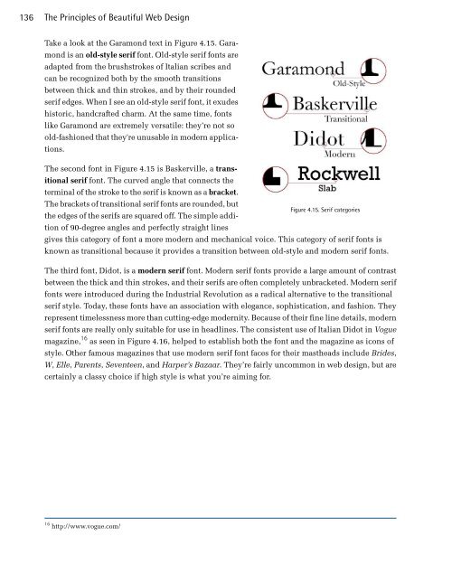
Take a look at the Garamond text in Figure 4.15. Garamond<br />
is an old-style serif font. Old-style serif fonts are<br />
adapted from the brushstrokes of Italian scribes and<br />
can be recognized both by the smooth transitions<br />
between thick and thin strokes, and by their rounded<br />
serif edges. When I see an old-style serif font, it exudes<br />
historic, handcrafted charm. At the same time, fonts<br />
like Garamond are extremely versatile: they’re not so<br />
old-fashioned that they're unusable in modern applications.<br />
The second font in Figure 4.15 is Baskerville, a transitional<br />
serif font. The curved angle that connects the<br />
terminal of the stroke to the serif is known as a bracket.<br />
The brackets of transitional serif fonts are rounded, but<br />
Figure 4.15. Serif categories<br />
the edges of the serifs are squared off. The simple addition<br />
of 90-degree angles and perfectly straight lines<br />
gives this category of font a more modern and mechanical voice. This category of serif fonts is<br />
known as transitional because it provides a transition between old-style and modern serif fonts.<br />
The third font, Didot, is a modern serif font. Modern serif fonts provide a large amount of contrast<br />
between the thick and thin strokes, and their serifs are often completely unbracketed. Modern serif<br />
fonts were introduced during the Industrial Revolution as a radical alternative to the transitional<br />
serif style. Today, these fonts have an association with elegance, sophistication, and fashion. They<br />
represent timelessness more than cutting-edge modernity. Because of their fine line details, modern<br />
serif fonts are really only suitable for use in headlines. The consistent use of Italian Didot in Vogue<br />
magazine, 16 as seen in Figure 4.16, helped to establish both the font and the magazine as icons of<br />
style. Other famous magazines that use modern serif font faces for their mastheads include Brides,<br />
W, Elle, Parents, Seventeen, and Harper’s Bazaar. They’re fairly uncommon in web design, but are<br />
certainly a classy choice if high style is what you’re aiming for.<br />
16 http://www.vogue.com/