

design3

You also want an ePaper? Increase the reach of your titles
YUMPU automatically turns print PDFs into web optimized ePapers that Google loves.
108<br />
The Principles of Beautiful Web Design<br />
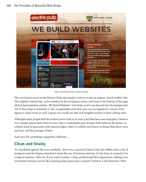
Figure 3.28. Electric Pulp: modern grunge<br />
The wood grain used on the Electric Pulp site simply exists to evoke an organic, hand-crafted vibe.<br />
The slightly rotated logo, active marker on the navigation menu, and trees at the bottom of the page<br />
all feel hand painted, and the “We Build Websites” text looks as if it was burned into the background.<br />
All of this helps to establish a very recognizable style that you can see repeated in much of the<br />
agency’s client work as well. I guess you could say that rich tangible texture is their calling card.<br />
Although some people feel the wicked worn look is (or was) a fad that has come and gone, I believe<br />
it’s a design option that’s here to stay. Like a comfortable pair of jeans with holes in the knees, or<br />
a faded stack of postcards with tattered edges, there is validity and honor in things that show wear<br />
and tear, and the passage of time.<br />
And now for something completely different …<br />
Clean and Grainy<br />
As a backlash against the worn aesthetic, there was a period of time in the late 2000s when a lot of<br />
designers and developers decided to buck the use of textures entirely. At the time, it seemed to be<br />
a logical reaction. After all, if you want to make a crisp, professional first impression, adding a ton<br />
of extreme textures can be like wearing holey jeans and a concert T-shirt to a job interview. That