

design3

You also want an ePaper? Increase the reach of your titles
YUMPU automatically turns print PDFs into web optimized ePapers that Google loves.
82<br />
The Principles of Beautiful Web Design<br />
Application: Choosing a Color Scheme<br />
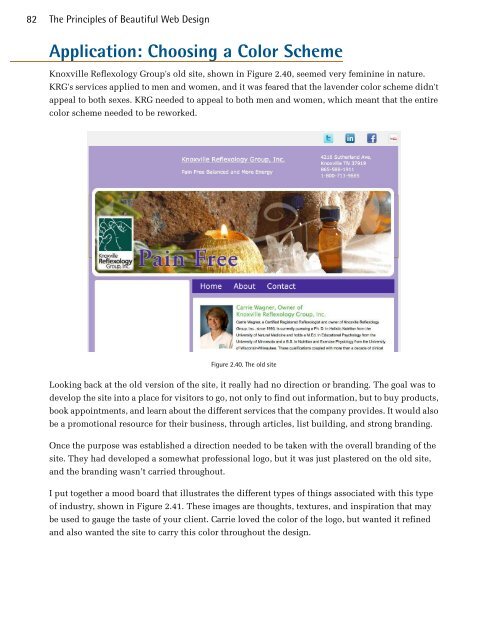
Knoxville Reflexology Group's old site, shown in Figure 2.40, seemed very feminine in nature.<br />
KRG's services applied to men and women, and it was feared that the lavender color scheme didn't<br />
appeal to both sexes. KRG needed to appeal to both men and women, which meant that the entire<br />
color scheme needed to be reworked.<br />
Figure 2.40. The old site<br />
Looking back at the old version of the site, it really had no direction or branding. The goal was to<br />
develop the site into a place for visitors to go, not only to find out information, but to buy products,<br />
book appointments, and learn about the different services that the company provides. It would also<br />
be a promotional resource for their business, through articles, list building, and strong branding.<br />
Once the purpose was established a direction needed to be taken with the overall branding of the<br />
site. They had developed a somewhat professional logo, but it was just plastered on the old site,<br />
and the branding wasn’t carried throughout.<br />
I put together a mood board that illustrates the different types of things associated with this type<br />
of industry, shown in Figure 2.41. These images are thoughts, textures, and inspiration that may<br />
be used to gauge the taste of your client. Carrie loved the color of the logo, but wanted it refined<br />
and also wanted the site to carry this color throughout the design.