Download complete issue - IndexUniverse.com
Download complete issue - IndexUniverse.com
Download complete issue - IndexUniverse.com

Create successful ePaper yourself
Turn your PDF publications into a flip-book with our unique Google optimized e-Paper software.
over the 30-year span. “Business equipment” has seen<br />
an average of nearly six different top dogs in each of the<br />
G-8 countries; this may go a long way toward explaining<br />
why the top dogs in “business equipment” have the most<br />
wretched results, lagging their intracountry <strong>com</strong>petitors<br />
by an average of 12 percent per year over the subsequent<br />
decade. As in the U.S., energy top dogs fare best in the<br />
G-8, but this means they only hurt their investors by a bit<br />
less than 2 percent per year over the subsequent decade.<br />
In Arnott (2010), we found an even stronger relationship<br />
for the overall top dog, the largest <strong>com</strong>pany in the U.S.<br />
stock market by market cap. For purposes of this article,<br />
we term this stock the “national top dog.” In Figure 1, we<br />
saw that the average sector top dog in the United States<br />
underperformed the average stock in its own sector by over<br />
3 percent per year over the next decade; also, we can see<br />
that the U.S. national top dog underperforms the average<br />
Figure 3<br />
Growth Of $1,<br />
1951–2011<br />
10,000<br />
1000<br />
Comparative Performance Of US Top Dogs,<br />
Against Broad Market, CW And EW, 1951–2011<br />
100<br />
10<br />
1<br />
0.1<br />
1951<br />
1956<br />
1961<br />
1966<br />
1971<br />
1976<br />
1981<br />
1986<br />
1991<br />
1996<br />
2001<br />
2006<br />
■ US 1000 EW ■ US 1000 CW ■ Sector Top Dogs ■ National Top Dog<br />
Source: Research Afliates<br />
Figure 4<br />
Growth Of $1,<br />
1951–2011<br />
Relative Performance Of US Top Dogs And CW Market,<br />
Against EW Broad Market, 1951–2011<br />
10.00<br />
1.00<br />
0.10<br />
0.01<br />
1951<br />
1956<br />
1961<br />
1966<br />
Source: Research Afliates<br />
www.journalofindexes.<strong>com</strong><br />
1971<br />
1976<br />
1981<br />
1986<br />
1991<br />
1996<br />
2001<br />
2006<br />
■ US 1000 CW ■ Sector Top Dogs ■ National Top Dog<br />
<strong>com</strong>pany in the U.S. stock market by an average of 5 percent<br />
per year, over the subsequent decade.<br />
At this writing, the U.S. national top dog is Apple Inc.;<br />
however, there were six other <strong>com</strong>panies wearing that<br />
crown over the past 60 years. Whether Apple disappoints is<br />
anyone’s guess. But history is not encouraging; it’s currently<br />
priced to reflect a consensus expectation that it will be<br />
the largest source of profit distributions to its shareholders<br />
of any <strong>com</strong>pany on the planet.<br />
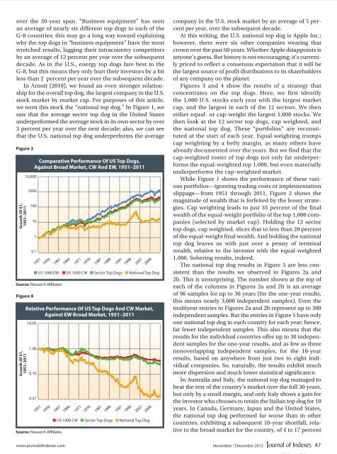
Figures 3 and 4 show the results of a strategy that<br />
concentrates on the top dogs. Here, we first identify<br />
the 1,000 U.S. stocks each year with the largest market<br />
cap, and the largest in each of the 12 sectors. We then<br />
either equal- or cap-weight the largest 1,000 stocks. We<br />
then look at the 12 sector top dogs, cap weighted, and<br />
the national top dog. These “portfolios” are reconstituted<br />
at the start of each year. Equal weighting trumps<br />
cap weighting by a hefty margin, as many others have<br />
already documented over the years. But we find that the<br />
cap-weighted roster of top dogs not only far underperforms<br />
the equal-weighted top 1,000, but even materially<br />
underperforms the cap-weighted market.<br />
While Figure 1 shows the performance of these various<br />
portfolios—ignoring trading costs or implementation<br />
slippage—from 1951 through 2011, Figure 2 shows the<br />
magnitude of wealth that is forfeited by the lesser strategies.<br />
Cap weighting leads to just 35 percent of the final<br />
wealth of the equal-weight portfolio of the top 1,000 <strong>com</strong>panies<br />
(selected by market cap). Holding the 12 sector<br />
top dogs, cap weighted, slices that to less than 20 percent<br />
of the equal-weight final wealth. And holding the national<br />
top dog leaves us with just over a penny of terminal<br />
wealth, relative to the investor with the equal-weighted<br />
1,000. Sobering results, indeed.<br />
The national top dog results in Figure 5 are less consistent<br />
than the results we observed in Figures 2a and<br />
2b. This is unsurprising. The number shown at the top of<br />
each of the columns in Figures 2a and 2b is an average<br />
of 96 samples for up to 30 years (for the one-year results,<br />
this means nearly 3,000 independent samples). Even the<br />
multiyear entries in Figures 2a and 2b represent up to 300<br />
independent samples. But the entries in Figure 5 have only<br />
one national top dog in each country for each year; hence,<br />
far fewer independent samples. This also means that the<br />
results for the individual countries offer up to 30 independent<br />
samples for the one-year results, and as few as three<br />
nonoverlapping independent samples, for the 10-year<br />
results, based on anywhere from just two to eight individual<br />
<strong>com</strong>panies. So, naturally, the results exhibit much<br />
more dispersion and much lower statistical significance.<br />
In Australia and Italy, the national top dog managed to<br />
beat the rest of the country’s market over the full 30 years,<br />
but only by a small margin, and only Italy shows a gain for<br />
the investor who chooses to retain the Italian top dog for 10<br />
years. In Canada, Germany, Japan and the United States,<br />
the national top dog performed far worse than in other<br />
countries, exhibiting a subsequent 10-year shortfall, relative<br />
to the broad market for the country, of 4 to 17 percent<br />
November / December 2012 47