Create successful ePaper yourself
Turn your PDF publications into a flip-book with our unique Google optimized e-Paper software.
users at the top of their feeds of content at the outset, and again each time the feed is<br />
refreshed. This is different from Twitter, which positions users at the bottom of the list<br />
with the oldest content. Although seemingly small, this difference does result in a different<br />
flow with users swiping up to go down the list through new content before reaching old<br />
content and vice versa. Twitter had the onus of introducing this new interaction to users<br />
and thus needed to make it learnable. They did so by letting the users discover it by<br />
putting it right in their path; the same interaction accomplishes both navigation and<br />
refreshing—in iOS Mail and Facebook there are two separate interactions.<br />
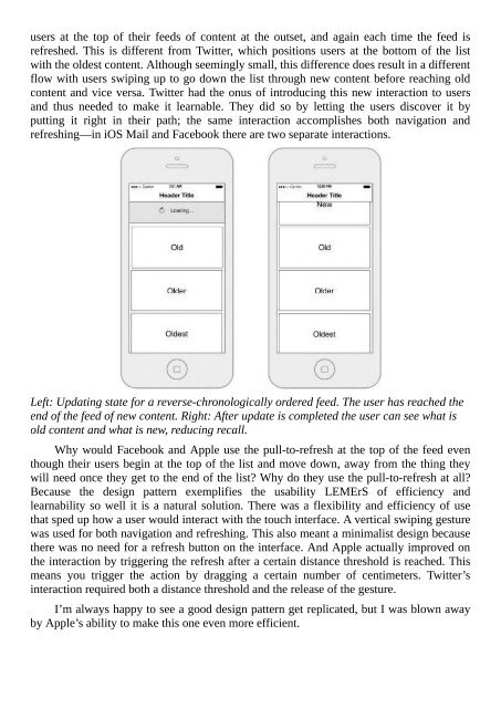
Left: Updating state for a reverse-chronologically ordered feed. The user has reached the<br />
end of the feed of new content. Right: After update is completed the user can see what is<br />
old content and what is new, reducing recall.<br />
Why would Facebook and Apple use the pull-to-refresh at the top of the feed even<br />
though their users begin at the top of the list and move down, away from the thing they<br />
will need once they get to the end of the list? Why do they use the pull-to-refresh at all?<br />
Because the design pattern exemplifies the usability LEMErS of efficiency and<br />
learnability so well it is a natural solution. There was a flexibility and efficiency of use<br />
that sped up how a user would interact with the touch interface. A vertical swiping gesture<br />
was used for both navigation and refreshing. This also meant a minimalist design because<br />
there was no need for a refresh button on the interface. And Apple actually improved on<br />
the interaction by triggering the refresh after a certain distance threshold is reached. This<br />
means you trigger the action by dragging a certain number of centimeters. Twitter’s<br />
interaction required both a distance threshold and the release of the gesture.<br />
I’m always happy to see a good design pattern get replicated, but I was blown away<br />
by Apple’s ability to make this one even more efficient.


