


Create successful ePaper yourself
Turn your PDF publications into a flip-book with our unique Google optimized e-Paper software.
A PICTURE IS WORTH A THOUSAND WORDS, BUT WORDS<br />
COUNT TOO<br />
A chapter on storytelling can’t fail to address the words we write in UX. It is debatable<br />
who should be in charge of writing copy. Almost everyone involved likes to have a say,<br />
but interactive and educational copy is the province of the UX designer. If it isn’t thought<br />
of as part of UX, then it will likely be simply layered onto a design, not made a part of the<br />
experience, and bad word choices may go untested.<br />
One key thing to keep in mind is that the text used is not only doing the work of<br />
instructing users, it’s also an element of a product’s branding. The tone of your copy<br />
should be carefully considered, representing the tone of your product. Whimsical language<br />
is great for a fun or kid-oriented app, but a more serious tone should be used for a hard<br />
news product. Settling on the perfect wording choices can be agonizing, because even a<br />
very small snafu in wording can lead to big problems. But that’s one reason why the copy<br />
deserves the same amount of attention, if not more, than other polishes.<br />
When I speak about copy being part of the experience and not a layer on top of it, I<br />
mean that quite literally. Overlays that teach users about the interface have the opposite<br />
effect of what they are intended for, in my experience.<br />
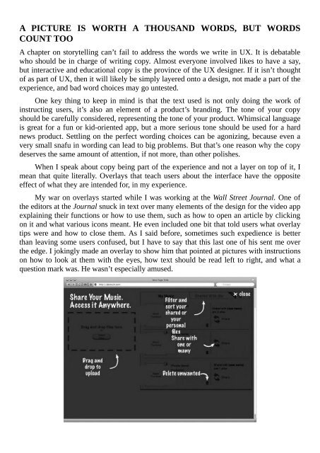
My war on overlays started while I was working at the Wall Street Journal. One of<br />
the editors at the Journal snuck in text over many elements of the design for the video app<br />
explaining their functions or how to use them, such as how to open an article by clicking<br />
on it and what various icons meant. He even included one bit that told users what overlay<br />
tips were and how to close them. As I said before, sometimes such expedience is better<br />
than leaving some users confused, but I have to say that this last one of his sent me over<br />
the edge. I jokingly made an overlay to show him that pointed at pictures with instructions<br />
on how to look at them with the eyes, how text should be read left to right, and what a<br />
question mark was. He wasn’t especially amused.