


Create successful ePaper yourself
Turn your PDF publications into a flip-book with our unique Google optimized e-Paper software.
THE ADVANTAGES OF WEB VERSUS APP<br />
I was working at the Wall Street Journal when responsive web design made its way onto<br />
the scene. The Boston Globe revealed a redesign of its site, and as we widened and<br />
narrowed our browser windows everyone got a little jealous. The Globe had one design<br />
that worked on iPhone, iPad, and all the different Android phones and tablets. Granted,<br />
you couldn’t find the site in an app store, but there was something amazing about how<br />
elegant their solution was. Our head of design technology had reviewed the new system,<br />
and he wanted to explore how we might employ it to give our users a better experience<br />
than our current mobile site. I and the other UX designer on the team dove into the new<br />
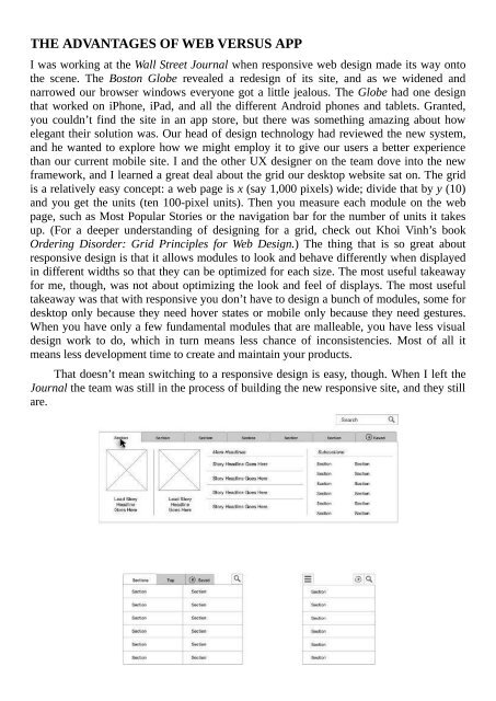
framework, and I learned a great deal about the grid our desktop website sat on. The grid<br />
is a relatively easy concept: a web page is x (say 1,000 pixels) wide; divide that by y (10)<br />
and you get the units (ten 100-pixel units). Then you measure each module on the web<br />
page, such as Most Popular Stories or the navigation bar for the number of units it takes<br />
up. (For a deeper understanding of designing for a grid, check out Khoi Vinh’s book<br />
Ordering Disorder: Grid Principles for Web <strong>Design</strong>.) The thing that is so great about<br />
responsive design is that it allows modules to look and behave differently when displayed<br />
in different widths so that they can be optimized for each size. The most useful takeaway<br />
for me, though, was not about optimizing the look and feel of displays. The most useful<br />
takeaway was that with responsive you don’t have to design a bunch of modules, some for<br />
desktop only because they need hover states or mobile only because they need gestures.<br />
When you have only a few fundamental modules that are malleable, you have less visual<br />
design work to do, which in turn means less chance of inconsistencies. Most of all it<br />
means less development time to create and maintain your products.<br />
That doesn’t mean switching to a responsive design is easy, though. When I left the<br />
Journal the team was still in the process of building the new responsive site, and they still<br />
are.
 Change language