

Focus On Lighting Photos Focus on the Fundamentals.pdf

You also want an ePaper? Increase the reach of your titles
YUMPU automatically turns print PDFs into web optimized ePapers that Google loves.
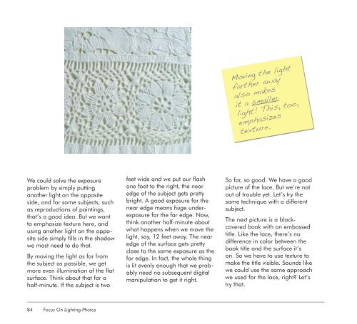
We could solve <strong>the</strong> exposure<br />
problem by simply putting<br />
ano<strong>the</strong>r light <strong>on</strong> <strong>the</strong> opposite<br />
side, and for some subjects, such<br />
as reproducti<strong>on</strong>s of paintings,<br />
that’s a good idea. But we want<br />
to emphasize texture here, and<br />
using ano<strong>the</strong>r light <strong>on</strong> <strong>the</strong> opposite<br />
side simply fills in <strong>the</strong> shadow<br />
we most need to do that.<br />
By moving <strong>the</strong> light as far from<br />
<strong>the</strong> subject as possible, we get<br />
more even illuminati<strong>on</strong> of <strong>the</strong> flat<br />
surface. Think about that for a<br />
half-minute. If <strong>the</strong> subject is two<br />
84<br />
<str<strong>on</strong>g>Focus</str<strong>on</strong>g> <str<strong>on</strong>g>On</str<strong>on</strong>g> <str<strong>on</strong>g>Lighting</str<strong>on</strong>g> <str<strong>on</strong>g>Photos</str<strong>on</strong>g><br />
feet wide and we put our flash<br />
<strong>on</strong>e foot to <strong>the</strong> right, <strong>the</strong> near<br />
edge of <strong>the</strong> subject gets pretty<br />
bright. A good exposure for <strong>the</strong><br />
near edge means huge underexposure<br />
for <strong>the</strong> far edge. Now,<br />
think ano<strong>the</strong>r half-minute about<br />
what happens when we move <strong>the</strong><br />
light, say, 12 feet away. The near<br />
edge of <strong>the</strong> surface gets pretty<br />
close to <strong>the</strong> same exposure as <strong>the</strong><br />
far edge. In fact, <strong>the</strong> whole thing<br />
is lit evenly enough that we probably<br />
need no subsequent digital<br />
manipulati<strong>on</strong> to get it right.<br />
Moving <strong>the</strong> light<br />
far<strong>the</strong>r away<br />
also makes<br />
it a smaller<br />
light! This, too,<br />
emphasizes<br />
texture.<br />
So far, so good. We have a good<br />
picture of <strong>the</strong> lace. But we’re not<br />
out of trouble yet. Let’s try <strong>the</strong><br />
same technique with a different<br />
subject.<br />
The next picture is a blackcovered<br />
book with an embossed<br />
title. Like <strong>the</strong> lace, <strong>the</strong>re’s no<br />
difference in color between <strong>the</strong><br />
book title and <strong>the</strong> surface it’s<br />
<strong>on</strong>. So we have to use texture to<br />
make <strong>the</strong> title visible. Sounds like<br />
we could use <strong>the</strong> same approach<br />
we used for <strong>the</strong> lace, right? Let’s<br />
try that.