- Page 2 and 3:
Design for Learning Principles, Pro
- Page 4 and 5:
Table of Contents Introduction ....
- Page 6 and 7:
Introduction Jason K. McDonald & Ri
- Page 8 and 9:
fill out these surveys as they will
- Page 10 and 11:
Part I Instructional Design Practic
- Page 12 and 13:
1 Becoming a Learning Designer Elle
- Page 14 and 15:
designers take when designing lesso
- Page 16 and 17:
to work? How will we engage learner
- Page 18 and 19:
All variants of Design Thinking emb
- Page 20 and 21:
prototypes and wireframes, graphic
- Page 22 and 23:
As Simon envisioned this role, the
- Page 24 and 25:
Mobile app design Social and collab
- Page 26 and 27:
may manifest. However, there are cu
- Page 28 and 29:
uild a survey, and conducting marke
- Page 30 and 31:
key principles and various helpful
- Page 32 and 33:
2 Designing for Diverse Learners Su
- Page 34 and 35:
equipment for access of computer-ba
- Page 36 and 37:
designers should not stop there but
- Page 38 and 39:
Visual Thinking and Animal Behavior
- Page 40 and 41:
Considerations Hearing difficulties
- Page 42 and 43:
Design for Learning 42
- Page 44 and 45:
Each of these dimensions will be di
- Page 46 and 47:
Differences Between UDL and DI With
- Page 48 and 49:
environments should support varied
- Page 50 and 51:
those on the fringes of dominant cu
- Page 52 and 53:
4. 5. 6. Observe universal design.
- Page 54 and 55:
Gay, G. (2002). Preparing for cultu
- Page 56 and 57:
diverse classrooms (3rd ed.). ASCD.
- Page 58 and 59:
When to Use Qualitative and Quantit
- Page 60 and 61:
3. 4. Dependability (reliability) i
- Page 62 and 63:
in interviewing, it’s not always
- Page 64 and 65:
4. 5. not?” Follow up by asking,
- Page 66 and 67:
Report Findings The final step is t
- Page 68 and 69:
acquisition, and c) foreign languag
- Page 70 and 71:
The study plan matrix operationaliz
- Page 72 and 73:
or teacher. Essentially, questions
- Page 74 and 75:
Definition of Effective Implementat
- Page 76 and 77:
obvious thing the invite should inc
- Page 78 and 79:
effects of known variables. ANCOVA
- Page 80 and 81:
6. transformations or computing of
- Page 82 and 83:
Even though there is a science fill
- Page 84 and 85:
influencing learner performance can
- Page 86 and 87:
Are we sure that instruction is goi
- Page 88 and 89:
Figure 1 provides an overview of ho
- Page 90 and 91:
from Tessmer & Richey (1997 While c
- Page 92 and 93:
Method of Analysis Needs Analysis D
- Page 94 and 95:
instructional designers will have a
- Page 96 and 97:
Level of Scale Low (1-2 weeks) Medi
- Page 98 and 99:
INSTRUCTIONAL DESIGN PROJECT INTAKE
- Page 100 and 101:
Cennamo, K., & Kalk, D., (2019). Re
- Page 102 and 103:
groundbreaking classic on human per
- Page 104 and 105:
5 Conducting a Learner Analysis Jos
- Page 106 and 107:
knowledge, and their demographics,
- Page 108 and 109:
or that has no connection to studen
- Page 110 and 111:
designing the best learning environ
- Page 112 and 113:
Fact-finding - Most conflicts are r
- Page 114 and 115:
Objective Define the purpose/vision
- Page 116 and 117:
Note. Persona example from https://
- Page 118 and 119:
Note. Persona example from https://
- Page 120 and 121:
go beyond the physical location and
- Page 122 and 123:
https://edtechbooks.org/-Snvzp Ambr
- Page 124 and 125:
knowledge influences memory in olde
- Page 126 and 127:
6 Problem Framing Vanessa Svihla Is
- Page 128 and 129:
An Example of How the Same Initial
- Page 130 and 131:
Figure 2 Problem Structure, Complex
- Page 132 and 133:
“framing agency” is a hallmark
- Page 134 and 135:
What Tools Help Designers Frame Pro
- Page 136 and 137:
designers coherently link the task
- Page 138 and 139:
easons for reframing are likelier t
- Page 140 and 141:
National Science Foundation. Refere
- Page 142 and 143:
7 Task and Content Analysis Levi Po
- Page 144 and 145:
analyzing interpersonal skills. Con
- Page 146 and 147:
facts, concept, and principles). On
- Page 148 and 149:
Length of nails 10-penny or less is
- Page 150 and 151:
content area. A course on home repa
- Page 152 and 153:
a. b. c. d. e. f. Tactile cue: Feel
- Page 154 and 155:
Conclusion Task/content analysis is
- Page 156 and 157:
8 Documenting Instructional Design
- Page 158 and 159:
Decision Typologies as They Relate
- Page 160 and 161:
Decisions Type of Decision- Making
- Page 162 and 163:
Naturalistic Decision-Making Exampl
- Page 164 and 165:
their design process to log and ref
- Page 166 and 167:
Conclusion While decision-making is
- Page 168 and 169:
knowledge and experience to solve i
- Page 170 and 171:
Luo, T., & Baaki, J. (2019). Gradua
- Page 172 and 173:
Tracey, M. W., & Hutchinson, A. (20
- Page 174 and 175:
Creating Creating practices are tho
- Page 176 and 177:
Many ideation techniques focus on g
- Page 178 and 179:
Noel Oh! Sorry. The PASS model—I
- Page 180 and 181:
Noel Nice. And we should make the j
- Page 182 and 183:
Table 1 Common Structured Ideation
- Page 184 and 185:
Contrast the two techniques you tri
- Page 186 and 187:
with no instructions and putting th
- Page 188 and 189:
Additional Readings and Resources T
- Page 190 and 191:
Daly, S. R., Seifert, C. M., Yilmaz
- Page 192 and 193:
initial investigation of expert pra
- Page 194 and 195:
10 Instructional Strategies Joshua
- Page 196 and 197:
Learning Domain Strategies Each lea
- Page 198 and 199:
muscular actions. When teaching psy
- Page 200 and 201:
specific to general You could teach
- Page 202 and 203:
values or needs. Relevance is also
- Page 204 and 205:
well-defined learning goals; instru
- Page 206 and 207:
11 Instructional Design Prototyping
- Page 208 and 209:
psychology has established that the
- Page 210 and 211:
Table 1 Prototyping Stages and Goal
- Page 212 and 213:
Note. Many of the examples provided
- Page 214 and 215:
other design contexts such as indus
- Page 216 and 217:
Note. CC-BY from Rosenfeld Media, a
- Page 218 and 219:
they reach a product that will acco
- Page 220 and 221:
This approach is believed to be les
- Page 222 and 223:
prototype, you can learn about the
- Page 224 and 225:
doi.org/10.1080/1463922X.2015.10140
- Page 226 and 227:
Merrill, M. D., & Wilson, B. (2007)
- Page 228 and 229:
Evaluating Evaluating practices hel
- Page 230 and 231:
Defining Critique Used throughout t
- Page 232 and 233:
Design for Learning 232
- Page 234 and 235:
on the work itself and not on the d
- Page 236 and 237:
Any critique develops both the crit
- Page 238 and 239:
Group Critique (illustration by the
- Page 240 and 241:
Design for Learning 240
- Page 242 and 243:
2010). Studios are based on the ide
- Page 244 and 245:
can be paired or grouped as need be
- Page 246 and 247:
which are overwhelmingly negative o
- Page 248 and 249:
176-177). Mahwah: Erlbaum. Dannels,
- Page 250 and 251:
13 The Role of Design Judgment and
- Page 252 and 253:
instructional module to be delivere
- Page 254 and 255:
The second is instrumental judgment
- Page 256 and 257:
concerned with design tools—every
- Page 258 and 259:
(Tracey et al., 2014). It is usuall
- Page 260 and 261:
the design should be focused on. To
- Page 262 and 263:
appreciate public libraries. We lik
- Page 264 and 265:
References and Suggested Readings B
- Page 266 and 267:
49(4), 3-17. Stolterman, E., McAtee
- Page 268 and 269:
ADDIE Model of Design (Fav203, 2012
- Page 270 and 271:
Reaction In order to have effective
- Page 272 and 273:
“When the cook tastes the soup th
- Page 274 and 275:
Summative Dick et al. (2015, p. 320
- Page 276 and 277:
implementation of a design. Moseley
- Page 278 and 279:
One-to-One The one-to-one evaluatio
- Page 280 and 281:
Field Trial Summative Evaluation Th
- Page 282 and 283:
Stake’s Model Stake in 1969 creat
- Page 284 and 285:
the goal-free evaluator. Younker pr
- Page 286 and 287:
Conclusion Evaluation is the proces
- Page 288 and 289:
2. 3. 4. Draw a diagram of the iter
- Page 290 and 291:
References Boston, C. (2002). The c
- Page 292 and 293:
Youker, B. W. (2013). Goal-free eva
- Page 294 and 295:
these data. Historically, any neede
- Page 296 and 297:
student learning in a specific cont
- Page 298 and 299:
Build: Designing for Data, Instrume
- Page 300 and 301:
An open source software implementat
- Page 302 and 303:
assessments require students to App
- Page 304 and 305:
A Worked Example Lumen Learning, a
- Page 306 and 307:
learning outcome. This activity pro
- Page 308 and 309:
Part II Instructional Design Knowle
- Page 310 and 311:
16 Learning Theories Beth Oyarzun &
- Page 312 and 313:
evokes a specific functional reacti
- Page 314 and 315:
For example, if the desired learnin
- Page 316 and 317:
example of a cognitive constructivi
- Page 318 and 319:
Yourself (DIY) forum. You may also
- Page 320 and 321:
self-efficacy. Social cognitive the
- Page 322 and 323:
motivators can enhance self-determi
- Page 324 and 325:
Keller’s ARCS Model Within the mo
- Page 326 and 327:
and models helps guide your design
- Page 328 and 329:
Dewey, J. (1938). Experience and ed
- Page 330 and 331:
designers through the lenses of dif
- Page 332 and 333:
Formally linking instructional desi
- Page 334 and 335:
The instructional theory framework
- Page 336 and 337:
3. 4. 5. Precision, which reflects
- Page 338 and 339:
Using the Instructional Theory Fram
- Page 340 and 341:
Value Learning Experience Design Fu
- Page 342 and 343:
experience may undergo any number o
- Page 344 and 345:
Respect the Instructional Design Ir
- Page 346 and 347:
obsolete, to today’s mobile game-
- Page 348 and 349:
understand these terms, one’s des
- Page 350 and 351:
subject testing. Performance & Impr
- Page 352 and 353:
Research and Development, 62(1), 53
- Page 354 and 355:
Instructional-design theories and m
- Page 356 and 357:
19 The Nature and Use of Precedent
- Page 358 and 359:
that the benefits of this form of e
- Page 360 and 361:
employees to learn," or "minimal sc
- Page 362 and 363:
cases, there may be little to indic
- Page 364 and 365:
configurations, in which the design
- Page 366 and 367:
idea; "what if we put together some
- Page 368 and 369:
developing instruction, consider th
- Page 370 and 371:
The Noticing Journal The beginning
- Page 372 and 373:
simple, they were not called out in
- Page 374 and 375:
practice. European Journal of Marke
- Page 376 and 377:
Zimmerman, E. (2003). Play as resea
- Page 378 and 379:
Competency and Standard In this sec
- Page 380 and 381:
Instructional Design and Technology
- Page 382 and 383:
competencies to practitioners, rese
- Page 384 and 385:
2. 3. 4. 5. 6. 7. 8. 9. 10. Take a
- Page 386 and 387:
AECT certifies graduate certificate
- Page 388 and 389:
Authors Audience Research Method Te
- Page 390 and 391:
Application Exercises 1. 2. 3. 4. H
- Page 392 and 393:
the educational technologist multim
- Page 394 and 395:
21 Design Thinking Vanessa Svihla E
- Page 396 and 397:
advantage of them? If design thinki
- Page 398 and 399:
Additional Reading For another grea
- Page 400 and 401:
When designing with end-users, we g
- Page 402 and 403:
implications for the agency, and ev
- Page 404 and 405:
Risks and Pitfalls Associated with
- Page 406 and 407:
instance, consider the various appr
- Page 408 and 409:
ID models, approaches, practices an
- Page 410 and 411:
References Adams, R. S., Daly, S. R
- Page 412 and 413:
Muller, M. J., & Kuhn, S. (1993). P
- Page 414 and 415:
22 Robert Gagné and the Systematic
- Page 416 and 417:
Laboratory. He held multiple academ
- Page 418 and 419:
An example would be classifying mus
- Page 420 and 421:
of prior learning allows learners t
- Page 422 and 423:
had a process to follow, a blueprin
- Page 424 and 425:
consisting of the final evaluation
- Page 426 and 427:
each skill into its smallest step b
- Page 428 and 429:
War II to the rise of the systemati
- Page 430 and 431:
Heinich, R., Molenda, M., Russell,
- Page 432 and 433:
with an extensive knowledge and ski
- Page 434 and 435:
competencies (i.e., the integration
- Page 436 and 437:
highly‐structured knowledge, or c
- Page 438 and 439:
y employing modelling examples and
- Page 440 and 441:
to carry out those tasks up to stan
- Page 442 and 443:
To conclude, dealing with current a
- Page 444 and 445:
Janssen‐Noordman, A. M. B., van M
- Page 446 and 447:
24 Curriculum Design Processes Buck
- Page 448 and 449:
Curriculum design is a team sport.
- Page 450 and 451:
learning strategies that connect to
- Page 452 and 453:
Standards and competency frameworks
- Page 454 and 455:
Visit http://www.lxcanvas.com/ for
- Page 456 and 457:
Visit https://edtechbooks.org/-TTeu
- Page 458 and 459:
Figure 8 Conceptual Illustration of
- Page 460 and 461:
Learning Environment Modeling—A M
- Page 462 and 463:
In addition to curriculum design be
- Page 464 and 465:
essential skill for emerging educat
- Page 466 and 467:
feedback. This kind of static list
- Page 468 and 469:
ealize the key components of the ag
- Page 470 and 471:
Scrum Basics and Roles Watch on You
- Page 472 and 473:
Note. "The Agile PM Game (Aug '11)"
- Page 474 and 475:
process. There are many similaritie
- Page 476 and 477:
An Example of Scrum in Practice At
- Page 478 and 479: with similar user stories. Tripp an
- Page 480 and 481: Links and Resources Scrum Guide (A
- Page 482 and 483: how your design may need to incorpo
- Page 484 and 485: guide to scrum: The rules of the ga
- Page 486 and 487: 26 Designing Technology- Enhanced L
- Page 488 and 489: technologies, such as a computer or
- Page 490 and 491: Learning experiences are now design
- Page 492 and 493: Collaborativism (Online Collaborati
- Page 494 and 495: instructional methods with intentio
- Page 496 and 497: Pedagogical Intent—A Set of Core
- Page 498 and 499: PICRAT. However, a new model has be
- Page 500 and 501: PICRAT for Effective Technology Int
- Page 502 and 503: The research on CTML is quite exten
- Page 504 and 505: Challenge #4: Time/Cost/Efficiency
- Page 506 and 507: Bransford, J. D., Brown, A. L., & C
- Page 508 and 509: Koehler, M., & Mishra, P. (2009). W
- Page 510 and 511: 27 Designing Instructional Text Sha
- Page 512 and 513: Towards a Theoretical Perspective T
- Page 514 and 515: Principle 1: Simplify: Reduce Extra
- Page 516 and 517: cameras, lecture recording, and liv
- Page 518 and 519: Purpose and Placement of Instructio
- Page 520 and 521: and norms. Figure 6 provides an exa
- Page 522 and 523: emails are done with a short turnar
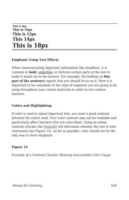
- Page 524 and 525: Numbering Numbering aids in sequenc
- Page 526 and 527: other”(p. 7). White space is nece
- Page 530 and 531: Application Exercises Exercise 1 Re
- Page 532 and 533: Education, 23(2), 243-265. Garrison
- Page 534 and 535: 28 Audio and Video Production for I
- Page 536 and 537: Audio The most common lossless audi
- Page 538 and 539: would be the highest quality. The b
- Page 540 and 541: microphone. Condenser microphones h
- Page 542 and 543: until you get to know your micropho
- Page 544 and 545: The larger the room, the greater th
- Page 546 and 547: Note. The top track is a voice trac
- Page 548 and 549: yourself will help you work with pr
- Page 550 and 551: Note. A more complete collection of
- Page 552 and 553: Video Editing Tools Once the video
- Page 554 and 555: the task on screen typically narrat
- Page 556 and 557: transitions, it can be tempting to
- Page 558 and 559: 29 Using Visual and Graphic Element
- Page 560 and 561: the manner in which they cause the
- Page 562 and 563: An Organizational Picture Illustrat
- Page 564 and 565: A Transformational Picture Using Mn
- Page 566 and 567: the instructional techniques employ
- Page 568 and 569: Google Image Search and the Usage R
- Page 570 and 571: information is presented, such as s
- Page 572 and 573: 30 Simulations and Games Jeff Batt
- Page 574 and 575: Video 1: How to Create a Watch Simu
- Page 576 and 577: from their mistakes. The key here i
- Page 578 and 579:
Providing a theme has a couple of r
- Page 580 and 581:
This type of progression tool is al
- Page 582 and 583:
If the learner gets the question co
- Page 584 and 585:
information from one screen to anot
- Page 586 and 587:
Video 5: Using Triggers Watch on Vi
- Page 588 and 589:
Video 6: Understanding Conditions W
- Page 590 and 591:
31 Designing Informal Learning Envi
- Page 592 and 593:
If we use this as a guide to identi
- Page 594 and 595:
exploration and even learning throu
- Page 596 and 597:
Principle 4: Leverage the Benefits
- Page 598 and 599:
competition fueled their natural in
- Page 600 and 601:
Application Exercise For your refle
- Page 602 and 603:
ule/ Cordova, D. I., & Lepper, M. R
- Page 604 and 605:
32 The Design of Holistic Learning
- Page 606 and 607:
design way: Intentional change in a
- Page 608 and 609:
proposed that all instructional pro
- Page 610 and 611:
[the student] be changed by it). Ap
- Page 612 and 613:
Application Exercise Using the same
- Page 614 and 615:
33 Measuring Student Learning Lisa
- Page 616 and 617:
helps instructional designers incre
- Page 618 and 619:
Example Assessment Alignment Table
- Page 620 and 621:
Multiple-Choice Best Practice Guide
- Page 622 and 623:
Tips for Writing Higher Order Think
- Page 624 and 625:
High-Quality Examples 1. Proof 1: G
- Page 626 and 627:
Rubrics As discussed earlier in the
- Page 628 and 629:
descriptors below. Numerical Descri
- Page 630 and 631:
esults help instructional designers
- Page 632 and 633:
Table of Specifications Template Us
- Page 634 and 635:
34 Working With Stakeholders and Cl
- Page 636 and 637:
are using that process. It's also i
- Page 638 and 639:
Scope of Work When beginning work o
- Page 640 and 641:
Once you agree on a file hosting se
- Page 642 and 643:
Not communicating expectations earl
- Page 644 and 645:
Catching plagiarism early is vital.
- Page 646 and 647:
Conclusion In this chapter we discu
- Page 648 and 649:
35 Leading Project Teams Ashley Smi
- Page 650 and 651:
The Initiation phase encompasses al
- Page 652 and 653:
impact on the project. In many case
- Page 654 and 655:
There are always tradeoffs for ever
- Page 656 and 657:
(Rath, 2007, p. i). I have found wh
- Page 658 and 659:
Effective Strategies in Leading a T
- Page 660 and 661:
Communicating Effectively Don’t k
- Page 662 and 663:
Managing Conflicts Have crucial con
- Page 664 and 665:
from https://ebookcentral.proquest.
- Page 666 and 667:
design process, however. Designers
- Page 668 and 669:
The Stages of Roger's Implementatio
- Page 670 and 671:
definition of “long-term” can b
- Page 672 and 673:
Relative Advantage The concept of r
- Page 674 and 675:
Application Exercise You are an ins
- Page 676 and 677:
Design for Learning 676
- Page 678 and 679:
Jason K. McDonald Dr. Jason K. McDo
- Page 680 and 681:
Richard E. West Dr. Richard E. West
- Page 682:
McDonald, J. K. &West, R. E.(2021).