THE PHOTOGRAPHIC EYE
THE PHOTOGRAPHIC EYE
THE PHOTOGRAPHIC EYE

Create successful ePaper yourself
Turn your PDF publications into a flip-book with our unique Google optimized e-Paper software.
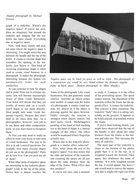
Student photograph by Michael<br />
Grassia.<br />
graph of a teakettle. Where's the<br />
negative space? If you're not sure,<br />
draw an imaginary line around the<br />
teakettle and imagine that the teakettle<br />
has been erased. Everything<br />
else is negative space.<br />
Now, look more closely and pick<br />
out areas where the negative space is<br />
interesting. You might notice the area<br />
between the handle and the top of the<br />
kettle. It creates a circular shape that<br />
resembles the opening in the teakettle,<br />
just below it. This kind of<br />
recurring (repeating) shape is often<br />
used to create visual harmony in a<br />
photograph. It makes the photograph<br />
interesting because the human eye<br />
automatically looks for such<br />
similarities.<br />
As you continue to look for shapes<br />
and to point them out in critique sessions,<br />
you will become increasingly<br />
aware of these visual harmonies.<br />
Your brain will decide that they are<br />
worthy of notice and, as a result,<br />
you'll begin to see them directly.<br />
Most people only sense visual harmonies<br />
vaguely, because they don't<br />
need to do more than that. As a<br />
photographer, however, your job is<br />
to use these and other composition<br />
tools, so you must learn to recognize<br />
them.<br />
At first you may need to make an<br />
effort to train your brain to take note<br />
of visual harmonies. The way to do<br />
this is to ask yourself questions. For<br />
example, how many circular shapes<br />
do you see in the photograph? There<br />
are at least five. Can you pick out all<br />
of them?<br />
What other areas of negative space<br />
are interesting in the teakettle photograph?<br />
Look at the tip of the spout.<br />
Notice how it almost touches the<br />
Negative space can be black (or gray) as well as white. This photograph of<br />
a construction site would be very bland without the dramatic angular<br />
frame of black space. (Student photograph by Mina Murphy.)<br />
frame of the photograph. Like visual<br />
harmonies, this also generates visual<br />
interest. Anytime an object comes<br />
near another or comes near the frame<br />
of a photograph, it creates visual tension.<br />
It's almost as if the object is<br />
pressing against the space between.<br />
Oddly enough, the tension is<br />
strongest when objects almost, but<br />
don't quite, touch. Michelangelo's<br />
painting of the hand of God reaching<br />
out to the hand of Adam is a famous<br />
example of this effect. The effect<br />
would be weakened if their fingertips<br />
actually met.<br />
Where else in the teakettle photograph<br />
is a similar effect achieved?<br />
Now, what about the rest of the<br />
negative space? You may notice that<br />
the sides and bottom of the teakettle<br />
(not counting the spout) are all just<br />
about the same distance from the<br />
edge of the frame. What effect does<br />
this produce?<br />
If you're not sure, take a moment<br />
to study it. Compare it to the effect<br />
of the protruding spout. The spout<br />
creates tension. The placement of the<br />
teakettle within the frame has the opposite<br />
effect. It centers the teakettle.<br />
This conveys a static sensation. The<br />
teakettle "feels" like it is sitting very<br />
solidly on the ground. It appears to<br />
be firmly placed, or grounded, within<br />
the frame.<br />
If you've been looking closely, you<br />
might have observed that the top of<br />
the handle is also about the same<br />
distance from the frame as the bottom<br />
and sides are. This increases the<br />
sense of stability.<br />
The main part of the teakettle is<br />
closer to the bottom of the photograph<br />
than it is to the top. It is<br />
weighted toward the bottom. Once<br />
again, this reinforces the sense of<br />
stability. If it were weighted toward<br />
the top, it would appear "top heavy,"<br />
and would tend to convey the impression<br />
that it might roll right out of the<br />
Shape 107