Download the file. - Groupe SEB
Download the file. - Groupe SEB
Download the file. - Groupe SEB

Create successful ePaper yourself
Turn your PDF publications into a flip-book with our unique Google optimized e-Paper software.
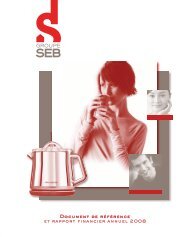
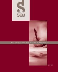
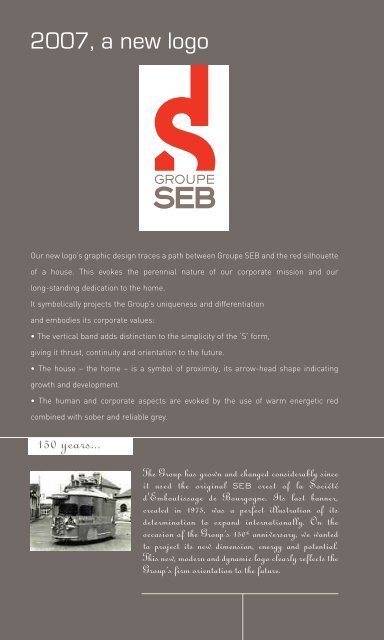
2007, a new logo<br />
Our new logo’s graphic design traces a path between <strong>Groupe</strong> <strong>SEB</strong> and <strong>the</strong> red silhouette<br />
of a house. This evokes <strong>the</strong> perennial nature of our corporate mission and our<br />
long-standing dedication to <strong>the</strong> home.<br />
It symbolically projects <strong>the</strong> Group’s uniqueness and differentiation<br />
and embodies its corporate values:<br />
• The vertical band adds distinction to <strong>the</strong> simplicity of <strong>the</strong> ‘S’ form,<br />
giving it thrust, continuity and orientation to <strong>the</strong> future.<br />
• The house – <strong>the</strong> home – is a symbol of proximity, its arrow-head shape indicating<br />
growth and development.<br />
• The human and corporate aspects are evoked by <strong>the</strong> use of warm energetic red<br />
combined with sober and reliable grey.<br />
150 years...<br />
12<br />
The Group has grown and changed considerably since<br />
it used <strong>the</strong> original <strong>SEB</strong> crest of la Société<br />
d'Emboutissage de Bourgogne. Its last banner,<br />
created in 1975, was a perfect illustration of its<br />
determination to expand internationally. On <strong>the</strong><br />
occasion of <strong>the</strong> Group’s 150 th anniversary, we wanted<br />
to project its new dimension, energy and potential.<br />
This new, modern and dynamic logo clearly reflects <strong>the</strong><br />
Group’s firm orientation to <strong>the</strong> future.