- Page 1 and 2:
CAMERON ADAMS ~ MARK BOULTON ~ ANDY
- Page 3 and 4:
Web Standards Creativity: Innovatio
- Page 6 and 7:
Contents About the Technical Review
- Page 8 and 9:
PART 2: EFFECTIVE PRINT TECHNIQUES
- Page 10 and 11:
About the Technical Reviewer Molly
- Page 12 and 13:
Mark Boulton I’d like to thank Kh
- Page 14 and 15:
Getting Creative with Web Standards
- Page 16 and 17:
Figure 5. The Zen Garden is still g
- Page 18 and 19:
Layout Magic Welcome to Part 1 of o
- Page 20:
Before starting Erskine Design in 2
- Page 23 and 24:
6 Figure 1-2. The completed Dirty P
- Page 26 and 27:
Dirty pretty presentation When buil
- Page 28 and 29:
Background Next, we apply the main
- Page 30 and 31:
Finally, the main content selector
- Page 32 and 33:
The markup is as follows. Note that
- Page 34 and 35:
Unless you study the end result clo
- Page 36 and 37:
Tables Descendant selectors are ess
- Page 38 and 39:
These very simple rules, and the fa
- Page 40 and 41:
Conclusion Of course, building the
- Page 42 and 43:
Dan Rubin spends his days blending
- Page 44 and 45:
Figure 2-1. On the left, the origin
- Page 46 and 47:
The CMS challenge It doesn’t take
- Page 48 and 49:
The next step was spending some tim
- Page 50 and 51:
Videos Photos Extras Links Forum St
- Page 52 and 53:
Ever find yourself getting lost in
- Page 54 and 55:
z-index:100; left:29px; top:39px; m
- Page 56 and 57:
By looking at the markup generated
- Page 58 and 59:
Creating the illusion of vertical t
- Page 60 and 61:
The first argument defines the CSS
- Page 62 and 63:
Figure 2-9. Before (right) and afte
- Page 64 and 65:
Such a #teaser After styling the #t
- Page 66 and 67:
When time is of the essence, hacks
- Page 68 and 69:
Ethan Marcotte has been designing a
- Page 70 and 71:
Getting started The article templat
- Page 72 and 73:
Structuring the CSS Looking above t
- Page 74 and 75:
Adding a layer of style OK, enough
- Page 76 and 77:
A quick preview of our code at this
- Page 78 and 79:
For our narrow, 190-pixel-wide righ
- Page 80 and 81:
Strictly speaking, these class name
- Page 82 and 83:
Our column’s “background” wil
- Page 84 and 85:
Figure 3-14. The exact same templat
- Page 86 and 87:
Figure 3-17. The anatomy of our nar
- Page 88 and 89:
So there we have it: a single class
- Page 90 and 91:
Figure 3-21. The text size can be i
- Page 92 and 93:
anchor.setAttribute("href", "javasc
- Page 95 and 96:
78 4 Designing for Outside the Box
- Page 97 and 98:
80 Worries? “Oh baby, what’s th
- Page 99 and 100: 82 Stop worrying, start with markup
- Page 101 and 102: 84 A third-level heading proudly an
- Page 103 and 104: 86 Adding divisions from the conten
- Page 105 and 106: 88 With the elements and appropriat
- Page 107 and 108: 90 Styling WorrySome.net Whereas ma
- Page 109 and 110: 92 Take a peek at how your design i
- Page 111 and 112: 94 The final result of your column-
- Page 113 and 114: 96 Each of the paragraphs of introd
- Page 115 and 116: 98 While floats and image replaceme
- Page 117 and 118: 100 Well, maybe you’re not quite
- Page 119 and 120: 102 This will be followed by a spec
- Page 121 and 122: 104 The result of this is that your
- Page 123 and 124: 106 We'll give you another look at
- Page 125 and 126: 108 5 Creative Use of PNG Transpare
- Page 127 and 128: 110 PNG, GIF, and JPEG The PNG imag
- Page 129 and 130: 112 The image that needs to work on
- Page 131 and 132: 114 Wilson includes his transparent
- Page 133 and 134: 116 Now I’ll create a 1-by-1-pixe
- Page 135 and 136: 118 In another creative example, de
- Page 137 and 138: 120 A bit of CSS is then used t
- Page 139 and 140: 122 And then the CSS: a.photo-conta
- Page 141 and 142: 124 I’ve specified #cc0000
- Page 143 and 144: 126 However, I’ve reversed their
- Page 145 and 146: 128 var div = document.createElemen
- Page 147 and 148: 130 6 Grid Design for the Web mark
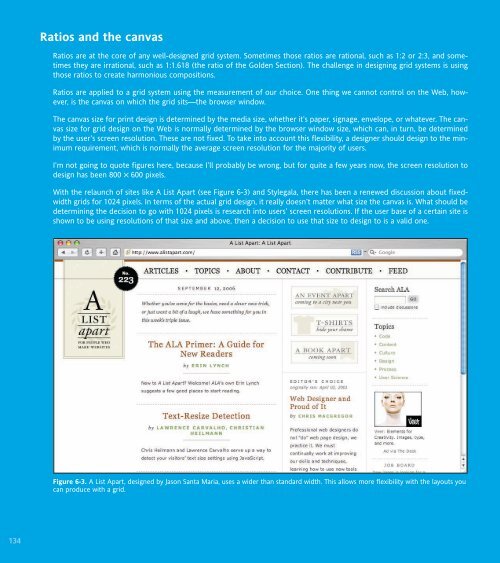
- Page 149: 132 What is a grid system? A grid s
- Page 153 and 154: 136 Beginning with the pen I like t
- Page 155 and 156: 138 Designing the columns The wiref
- Page 157 and 158: 140 This makes 1em roughly 10px (16
- Page 159 and 160: 142 The masthead includes several i
- Page 161 and 162: 144 Building the CSS I’m at the s
- Page 163 and 164: 146 Setting the width of the column
- Page 165 and 166: 148 Figure 6-16 shows the masthead
- Page 167 and 168: 150 It’s starting to look like a
- Page 169 and 170: 152 Issues with the design The proj
- Page 171: 154 Figure 6-20. The new WRC shares
- Page 174 and 175: Rob Weychert is a graphic designer,
- Page 176 and 177: The process Figure 7-1. Times New R
- Page 178 and 179: Here is a simplified version of the
- Page 180 and 181: Figure 7-5. Fixed-width layout: Hor
- Page 182 and 183: Translation Figure 7-9. Final layou
- Page 184 and 185: With just three short paragraphs to
- Page 186 and 187: Figure 7-12. A cohesive text block
- Page 188 and 189: As another elegant piece of insuran
- Page 190 and 191: Image replacement But I’m still n
- Page 192 and 193: All caps I am quite pleased with my
- Page 194 and 195: Small caps There is one more typogr
- Page 196 and 197: Figure 7-24. The effort was all wor
- Page 198 and 199: DOM Scripting Gems What book on web
- Page 200 and 201:
Ian Lloyd runs Accessify.com, a sit
- Page 202 and 203:
Preparing the foundations With a cl
- Page 204 and 205:
Identifying the sections The basic
- Page 206 and 207:
The addEvent function primes the we
- Page 208 and 209:
That’s our AddEvent part, mention
- Page 210 and 211:
for (i=0;i
- Page 212 and 213:
It is generally considered bad prac
- Page 214 and 215:
hide the sections from printout el[
- Page 216 and 217:
The following is the code required
- Page 218 and 219:
Sliding in the code In the proof-of
- Page 220 and 221:
For the purposes of building on the
- Page 222 and 223:
Never mind all that—what about sa
- Page 225 and 226:
208 9 Creating Dynamic Interfaces U
- Page 227 and 228:
210 Different layouts for different
- Page 229 and 230:
212 Figure 9-1. The UX Magazine web
- Page 231 and 232:
214 Figure 9-3. The White Pages web
- Page 233 and 234:
216 Browser size, not resolution Al
- Page 235 and 236:
218 There are two major changes bet
- Page 237 and 238:
220 return document.documentElement
- Page 239 and 240:
222 } else if (typeof target.attach
- Page 241 and 242:
224 Figure 9-7 shows the default vi
- Page 243 and 244:
226 The markup The high-level struc
- Page 245 and 246:
228 if (typeof event.stopPropagatio
- Page 247 and 248:
230 Styling with CSS Now that we’
- Page 249 and 250:
232 event = window.event; } if (typ
- Page 251 and 252:
234 function getPosition(theElement
- Page 253 and 254:
236 document.getElementsByTagName("
- Page 255 and 256:
238 ghostMarker.marked.appendChild(
- Page 257 and 258:
240 Keeping track of changes The te
- Page 259 and 260:
10 242 Accessible Sliding Navigatio
- Page 261 and 262:
244 The killer feature Admit it. Yo
- Page 263 and 264:
246 Accessibility and JavaScript Fo
- Page 265 and 266:
248 After the main link is clicked,
- Page 267 and 268:
250 Switching between CSS states wi
- Page 269 and 270:
252 Adding sliding behaviors Now th
- Page 271 and 272:
254 // set the height to a new valu
- Page 273 and 274:
256 When using a screen magnifier,
- Page 275 and 276:
258 If the user does repeat the “
- Page 277 and 278:
260 There may be unforeseen consequ
- Page 279 and 280:
262 Croft, Jeff, 109 CSS (Cascading
- Page 281 and 282:
264 max-width, 58, 71 @media print,
- Page 283:
266 websites A List Apart, 134 New


 Change language