

WEB STANDARDS CREATIVITY
WEB STANDARDS CREATIVITY
WEB STANDARDS CREATIVITY

You also want an ePaper? Increase the reach of your titles
YUMPU automatically turns print PDFs into web optimized ePapers that Google loves.
210<br />
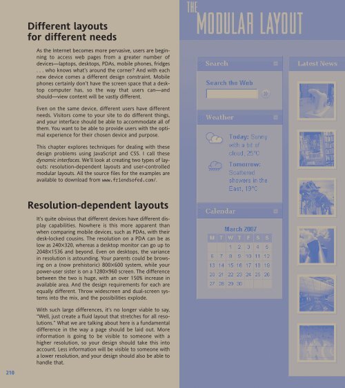
Different layouts<br />
for different needs<br />
As the Internet becomes more pervasive, users are beginning<br />
to access web pages from a greater number of<br />
devices—laptops, desktops, PDAs, mobile phones, fridges<br />
. . . who knows what’s around the corner? And with each<br />
new device comes a different design constraint. Mobile<br />
phones certainly don’t have the screen space that a desktop<br />
computer has, so the way that users can—and<br />
should—view content will be vastly different.<br />
Even on the same device, different users have different<br />
needs. Visitors come to your site to do different things,<br />
and your interface should be able to accommodate all of<br />
them. You want to be able to provide users with the optimal<br />
experience for their chosen device and purpose.<br />
This chapter explores techniques for dealing with these<br />
design problems using JavaScript and CSS. I call these<br />
dynamic interfaces. We’ll look at creating two types of layouts:<br />
resolution-dependent layouts and user-controlled<br />
modular layouts. All the source files for the examples are<br />
available to download from www.friendsofed.com/.<br />
Resolution-dependent layouts<br />
It’s quite obvious that different devices have different display<br />
capabilities. Nowhere is this more apparent than<br />
when comparing mobile devices, such as PDAs, with their<br />
desk-locked cousins. The resolution on a PDA can be as<br />
low as 240✕320, whereas a desktop monitor can go up to<br />
2048✕1536 and beyond. Even on desktops, the variance<br />
in resolution is astounding. Your parents could be browsing<br />
on a (now prehistoric) 800✕600 system, while your<br />
power-user sister is on a 1280✕960 screen. The difference<br />
between the two is huge, with an over 150% increase in<br />
available area. And the design requirements for each are<br />
equally different. Throw widescreen and dual-screen systems<br />
into the mix, and the possibilities explode.<br />
With such large differences, it’s no longer viable to say,<br />
“Well, just create a fluid layout that stretches for all resolutions.”<br />
What we are talking about here is a fundamental<br />
difference in the way a page should be laid out. More<br />
information is going to be visible to someone with a<br />
higher resolution, so your design should take this into<br />
account. Less information will be visible to someone with<br />
a lower resolution, and your design should also be able to<br />
handle that.


 Change language