

WEB STANDARDS CREATIVITY
WEB STANDARDS CREATIVITY
WEB STANDARDS CREATIVITY

You also want an ePaper? Increase the reach of your titles
YUMPU automatically turns print PDFs into web optimized ePapers that Google loves.
Adding gutters, margins,<br />
and padding<br />
You may have noticed there are no gutters in my initial<br />
grid design.<br />
Gutters are the gaps in between columns. They are there<br />
so text or images from different columns don’t run into<br />
each other. In grid system design, sometimes (depending<br />
on what theory you read), gutters are separate from the<br />
columns. This creates practical problems for us when<br />
designing grid systems on the Web because of the way we<br />
build the columns.<br />
Generally, but not always, the columns we create, using<br />
Web Standards, are divs, which are given widths and<br />
positioned and styled using CSS. So, ideally, we don’t want<br />
to be creating separate columns for the gutters. We<br />
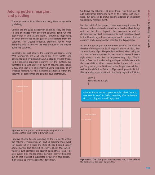
therefore deal with gutters as part of columns (see Figure<br />
6-10), and they are implemented using padding, or by<br />
creating margins, for the elements positioned within the<br />
columns or sometimes the column divs themselves.<br />
Figure 6-10. The gutters in this example are part of the<br />
columns, rather than sitting in between them.<br />
I always choose to add padding to the elements within<br />
the columns. This may mean I end up creating more work<br />
for myself when I write the style sheets. I could simply<br />
add a margin. But doing it this way ensures that when I<br />
want to butt elements up against each other, I can. This<br />
also avoids box model problems with Internet Explorer,<br />
but as that was not a supported browser in this design, I<br />
didn’t have to worry about that too much.<br />
So, I have my columns—all six of them. Now I can start to<br />
add horizontal elements, such as the footer and masthead.<br />
But before I do that, I need to address an important<br />
typography measurement.<br />
For the build of this project, there was a requirement for<br />
the user to be able to choose either a fixed or flexible layout.<br />
In the fixed layout, the columns would be<br />
determined by pixel measurements and therefore fixed.<br />
In the flexible layout, percentages would be used for the<br />
columns and ems would be used for the typography.<br />
An em is a typographic measurement equal to the width of<br />
the size of the typeface. So, if a typeface is set at 12px, then<br />
1em (width) is 12px. The problem we have when using em<br />
as a unit of measurement is that most browsers’ internal<br />
style sheets render 1em as approximately 16px. This in<br />
itself is fine, but it makes using multiples and divisions a little<br />
more difficult than it needs to be (unless, of course,<br />
you’re great at your 16 times table). To get around this, I<br />
reduce the default of 16px to 10px (see Figure 6-11). I do<br />
this by adding a declaration to the body tag in the CSS file:<br />
body {<br />
font-size: 62.5%;<br />
}<br />
Richard Rutter wrote a great article called “How to<br />
size text in ems” in 2004, detailing this technique<br />
(http://clagnut.com/blog/348/).<br />
Figure 6-11. The 10px gutter now becomes 1em, as I’ve defined<br />
the font size of the body to be 62.5%.<br />
chapter 6 Grid Design for the Web<br />
139


 Change language