

WEB STANDARDS CREATIVITY
WEB STANDARDS CREATIVITY
WEB STANDARDS CREATIVITY

You also want an ePaper? Increase the reach of your titles
YUMPU automatically turns print PDFs into web optimized ePapers that Google loves.
164<br />
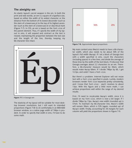
The almighty em<br />
An elastic layout’s secret weapon is the em. In both the<br />
print and web worlds, an em is a square of a typeface size,<br />
based on either the width of its widest character or the<br />
distance from the bottom of its lowest descender (such as<br />
the stem of a lowercase p) to the top of its highest ascender<br />
(such as the stem of a lowercase b) or diacritical mark<br />
(Figure 7-7). In CSS, an em is based on the font-size of<br />
the parent element. Thus, if I specify the width of my layout<br />
in ems, it will expand and contract as the text is<br />
resized, maintaining the proportion between the text size<br />
and the length of the line, thereby keeping my<br />
66-character line intact.<br />
Figure 7-7. A Georgia em<br />
The elasticity of my layout will be suitable for most desktop<br />
browser resolutions, but I still want its intended<br />
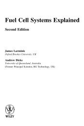
proportions (Figure 7-8) to sit comfortably in an 800✕600<br />
browser window, so a native page width of 740px is prudent.<br />
In order to specify that width in ems, I’ll have to do<br />
some math.<br />
25% 50%<br />
25%<br />
Figure 7-8. Approximate layout proportions<br />
My main content area (#main) needs to have a 66-character<br />
width, which also needs to be about 50% of the<br />
layout’s full width (#wrap). If I set a block of Georgia text<br />
with a width specified in ems, count the characters<br />
(including spaces) in a few lines, and divide the average of<br />
those lines by the width of the text block, I’ll discover that<br />
Georgia averages about 2.2 characters to an em. Therefore,<br />
a 66-character measure would be 30em, which<br />
would make #wrap 60em. If I divide 740px by 60, I get<br />
12.3px, and voila! I have a font-size.<br />
But there’s a problem. Internet Explorer will not resize<br />
text with a font-size specified in pixels. Luckily, modern<br />
browsers render font-size keywords pretty consistently,<br />
and I know that font-size: small resolves to about<br />
13px. With this figure and a little more math, I can<br />
achieve proportions well within the range of my desired<br />
results.<br />
First, I’ll need to recalculate #wrap’s width, since it is<br />
based on my font-size, which is now a bit larger. If I<br />
divide 740px by 13px, #wrap’s new width (rounded up) is<br />
57em. To maintain my 66-character line, #main’s width<br />
will remain 30em, which is 53% (again, rounded up) of<br />
#wrap’s width. Finally, accounting for 2% margins for each<br />
column will yield the proportions shown in Figure 7-9.


 Change language