

WEB STANDARDS CREATIVITY
WEB STANDARDS CREATIVITY
WEB STANDARDS CREATIVITY

You also want an ePaper? Increase the reach of your titles
YUMPU automatically turns print PDFs into web optimized ePapers that Google loves.
70<br />
There are a few items to note here:<br />
The block value for the module’s class attribute is a reusable piece of markup I’ve placed throughout the New York<br />
Magazine templates. It’s simply a hook for the Easy Clearing Method, and it’s added to those rules (.block:after,<br />
etc.) so that it contains any floats inside it.<br />
The row class inside the content area serves a similar function: if any of its child “column” divs are floated, they won’t<br />
escape their parent “row” div.<br />
The other value in the module’s class (module-in-section) acts as a kind of unique identifier for this type of module.<br />
I couldn’t use an actual id attribute here, as more than one of these types of modules might appear on a page—<br />
and per the HTML specification, an id must be unique within the page.<br />
With our markup in place, we can move on to styling it. Given that the wide and narrow versions of the module share the<br />
same aesthetic qualities (such as typography, color, and background images), I won’t discuss them here; rather, let’s focus on<br />
building out our two content columns.<br />
In the single-column mode, we can let the markup’s source order do the work for us. The first column will simply stack on<br />
top of the second, as shown in Figure 3-17. We can, however, apply a little CSS to clean things up a bit:<br />
.module-in-section .content {<br />
padding: 0 14px 13px;<br />
}<br />
body.ad-column-180 .module-in-section .col-1 {<br />
text-align: center;<br />
margin: 7px 0 10px;<br />
}<br />
The first rule simply applies some padding to our content div,<br />
giving our columns some breathing room. The second rule centers<br />
the column’s content (namely, the img) and adds some top<br />
and bottom margins. But as you might have noticed, we preface<br />
that second rule with the same body.ad-column-180 rule we<br />
used to create our narrow sidebar (in the “My class-fu is unstoppable”<br />
section). One class, two separate effects. Lightweight<br />
code is a beautiful thing, isn’t it?<br />
From this logic, we can apply the ad-column-300 class to the<br />
body element to create our two-column effect. We’ll need to<br />
float each column div—the first column floated to the right,<br />
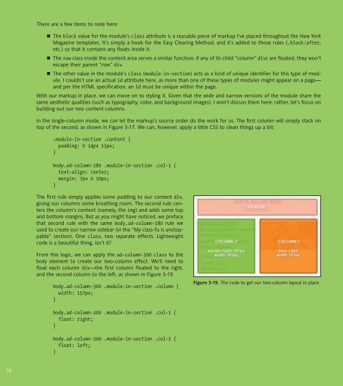
and the second column to the left, as shown in Figure 3-19.<br />
body.ad-column-300 .module-in-section .column {<br />
width: 157px;<br />
}<br />
body.ad-column-300 .module-in-section .col-1 {<br />
float: right;<br />
}<br />
body.ad-column-300 .module-in-section .col-2 {<br />
float: left;<br />
}<br />
Figure 3-19. The code to get our two-column layout in place


 Change language