PostGIS Raster : Extending PostgreSQL for The Support of ... - CoDE
PostGIS Raster : Extending PostgreSQL for The Support of ... - CoDE
PostGIS Raster : Extending PostgreSQL for The Support of ... - CoDE

You also want an ePaper? Increase the reach of your titles
YUMPU automatically turns print PDFs into web optimized ePapers that Google loves.
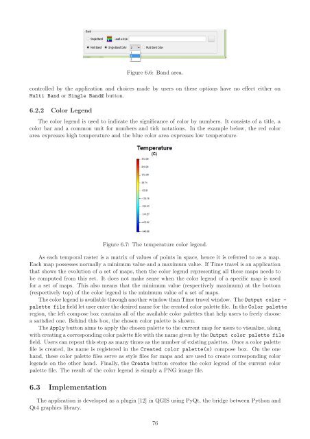
Figure 6.6: Band area.<br />
controlled by the application and choices made by users on these options have no effect either on<br />
Multi Band or Single Band£ button.<br />
6.2.2 Color Legend<br />
<strong>The</strong> color legend is used to indicate the significance <strong>of</strong> color by numbers. It consists <strong>of</strong> a title, a<br />
color bar and a common unit <strong>for</strong> numbers and tick notations. In the example below, the red color<br />
area expresses high temperature and the blue color area expresses low temperature.<br />
Figure 6.7: <strong>The</strong> temperature color legend.<br />
As each temporal raster is a matrix <strong>of</strong> values <strong>of</strong> points in space, hence it is referred to as a map.<br />
Each map possesses normally a minimum value and a maximum value. If Time travel is an application<br />
that shows the evolution <strong>of</strong> a set <strong>of</strong> maps, then the color legend representing all these maps needs to<br />
be computed from this set. It does not make sense when the color legend <strong>of</strong> a specific map is used<br />
<strong>for</strong> a set <strong>of</strong> maps. This also means that the minimum value (respectively maximum) at the bottom<br />
(respectively top) <strong>of</strong> the color legend is the minimum value <strong>of</strong> a set <strong>of</strong> maps.<br />
<strong>The</strong> color legend is available through another window than Time travel window. <strong>The</strong> Output color -<br />
palette file field let user enter the desired name <strong>for</strong> the created color palette file. In the Color palette<br />
region, the left compose box contains all <strong>of</strong> the available color palettes that help users to freely choose<br />
a satisfied one. Behind this box, the chosen color palette is shown.<br />
<strong>The</strong> Apply button aims to apply the chosen palette to the current map <strong>for</strong> users to visualize, along<br />
with creating a corresponding color palette file with the name given by the Output color palette file<br />
field. Users can repeat this step as many times as the number <strong>of</strong> existing palettes. Once a color palette<br />
file is created, its name is registered in the Created color palette(s) compose box. On the one<br />
hand, these color palette files serve as style files <strong>for</strong> maps and are used to create corresponding color<br />
legends on the other hand. Finally, the Create button creates the color legend <strong>of</strong> the current color<br />
palette file. <strong>The</strong> result <strong>of</strong> the color legend is simply a PNG image file.<br />
6.3 Implementation<br />
<strong>The</strong> application is developed as a plugin [12] in QGIS using PyQt, the bridge between Python and<br />
Qt4 graphics library.<br />
76