- Page 2 and 3:
Praise for Presentation Zen: Simple
- Page 4 and 5:
Presentation Zen: Simple Ideas on P
- Page 7 and 8:
Table of Contents Acknowledgments,
- Page 9 and 10:
Acknowledgments This book would not
- Page 11 and 12:
xi
- Page 13 and 14:
introduction Chapter 1 Presenting i
- Page 15 and 16:
This page intentionally left blank
- Page 17 and 18:
1 Presenting in Today’s World Wit
- Page 19 and 20:
The Presentation Zen Approach This
- Page 21 and 22:
Each Case Is Different Not all pres
- Page 23 and 24:
Still a Long Way to Go While presen
- Page 25 and 26:
Raising the Bar and Making a Differ
- Page 27 and 28:
The six aptitudes are: design, stor
- Page 29 and 30:
Symphony Focus, specialization, and
- Page 31 and 32:
Meaning Making a presentation is an
- Page 33 and 34:
Fourth, create a written document.
- Page 35 and 36:
Letting Go Part of the Presentation
- Page 37 and 38:
In Sum • Like a Japanese bento, g
- Page 39 and 40:
preparation Chapter 2 Creativity, L
- Page 41 and 42:
This page intentionally left blank
- Page 43 and 44:
2 Creativity, Limitations, and Cons
- Page 45 and 46:
Start with the Beginner’s Mind Ze
- Page 47 and 48:
You Are Creative Creative power and
- Page 49 and 50:
Be a Pirate! Inspiration. Where can
- Page 51 and 52:
The Art of Working with Restriction
- Page 53 and 54:
Pecha Kucha: A Sign of the Changing
- Page 55 and 56:
In Sum • Preparing, designing, an
- Page 57 and 58:
3 Planning Analog One of the most i
- Page 59 and 60:
During the planning stages of a pre
- Page 61 and 62:
“If you have the ideas, you can d
- Page 63 and 64:
You may be thinking that this is a
- Page 65 and 66:
Chapter 3 Planning Analog 53
- Page 67 and 68:
Slowing Down to See Slowing down is
- Page 69 and 70:
The Need for Solitude Many believe
- Page 71 and 72:
It is only in still water that we c
- Page 73 and 74:
Asking the Right Questions It is sa
- Page 75 and 76:
Questions We Should Be Asking OK, s
- Page 77 and 78:
To get back to my wasted hour, the
- Page 79 and 80:
So what? (Image in slide from iStoc
- Page 81 and 82:
Three Parts of a Presentation If yo
- Page 83 and 84:
esulting in poor supporting visuals
- Page 85 and 86:
The Benefit of Planning Well If you
- Page 87 and 88:
In Sum • Slow down your busy mind
- Page 89 and 90:
4 Crafting the Story During your ti
- Page 91 and 92:
The first message sounds similar to
- Page 93 and 94:
• Stories. We tell stories all da
- Page 95 and 96: Chapter 4 Crafting the Story 83
- Page 97 and 98: In an interview with the Harvard Bu
- Page 99 and 100: Essentially, that’s it: Introduce
- Page 102 and 103: Stories and Authenticity I have see
- Page 104 and 105: It’s Not Just About Information P
- Page 106 and 107: Dana Atchley (1941-2000) A Digital
- Page 108 and 109: Step 1 Brainstorming. Step back, go
- Page 110 and 111: Step 4 Sketch your visuals. Now tha
- Page 112 and 113: Shown here are the title slide, the
- Page 114 and 115: Nancy Duarte CEO of Duarte, Inc., t
- Page 116 and 117: Moxie Software www.moxiesoftware.co
- Page 118 and 119: If you feel tempted to use a pictur
- Page 120 and 121: 108 Presentation Zen Many people ar
- Page 122 and 123: 110 Presentation Zen
- Page 124 and 125: Our lives are frittered away by det
- Page 126 and 127: 114 Presentation Zen
- Page 128 and 129: as interaction designers, are const
- Page 130 and 131: ack on the audience. Jobs used the
- Page 132 and 133: Shibumi (Elegance) Shibumi is a pri
- Page 134 and 135: superfluous or decorative. They wil
- Page 136 and 137: By stripping down an image to essen
- Page 138 and 139: However, if you visit coffee shops
- Page 140 and 141: Redux: Simplicity Is Not Easy Usual
- Page 142 and 143: 130 Presentation Zen
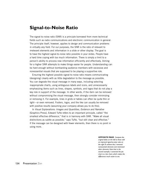
- Page 144 and 145: Presentation Design A common misund
- Page 148 and 149: BEFORE AFTER 136 Presentation Zen
- Page 150 and 151: Is the Nonessential Always “Noise
- Page 152 and 153: 2D or Not 2D? (That Is the Question
- Page 154 and 155: A Few Points About Bullet Points Th
- Page 156 and 157: Picture Superiority Effect Accordin
- Page 158 and 159: Using images is an efficient way to
- Page 160 and 161: The original slide showcases variou
- Page 162 and 163: All the slides on this page use ima
- Page 164 and 165: Where Can You Get Good Images? Gett
- Page 166 and 167: Text Within Images I almost always
- Page 168 and 169: A white background is placed behind
- Page 170 and 171: Creating Bilingual Visuals Combinin
- Page 172 and 173: Emptiness which is conceptually lia
- Page 174 and 175: Using Empty Space The blue slide at
- Page 176 and 177: Whether you use images of people or
- Page 178 and 179: Balance Balance is important in a d
- Page 180 and 181: One way to activate empty space and
- Page 182 and 183: The image on the right is not a sli
- Page 184 and 185: Create your own visual style. Let i
- Page 186 and 187: WEAK CONTRAST BETTER CONTRAST 174 P
- Page 188 and 189: 176 Presentation Zen
- Page 190 and 191: This title slide lacks a design pri
- Page 192 and 193: The slide on the left looks busier
- Page 194 and 195: This kind of slide is not unusual b
- Page 196 and 197:
The more strikingly visual your pre
- Page 199 and 200:
7 Sample Visuals: Images & Text In
- Page 201 and 202:
Chapter 7 Sample Visuals: Images &
- Page 203 and 204:
Think Like a Designer I created the
- Page 205 and 206:
Chapter 7 Sample Visuals: Images &
- Page 207 and 208:
Chapter 7 Sample Visuals: Images &
- Page 209 and 210:
Chapter 7 Sample Visuals: Images &
- Page 211 and 212:
Chapter 7 Sample Visuals: Images &
- Page 213 and 214:
Chapter 7 Sample Visuals: Images &
- Page 215 and 216:
These two visuals are from early in
- Page 217 and 218:
My Declaration of Independence Pam
- Page 219 and 220:
Chapter 7 Sample Visuals: Images &
- Page 221 and 222:
In Sum A good visual enhances the s
- Page 223 and 224:
delivery Chapter 8 The Art of Being
- Page 225 and 226:
This page intentionally left blank
- Page 227 and 228:
The Art of Being Completely Present
- Page 229 and 230:
Steve Jobs and the Art of the Sword
- Page 231 and 232:
You need technique and proper form,
- Page 233 and 234:
Chapter 8 The Art of Being Complete
- Page 235 and 236:
Learning from the Art of Judo You c
- Page 237 and 238:
Contribution and Being in the Momen
- Page 239 and 240:
swayed from side to side. Zander, t
- Page 241 and 242:
In Sum • Like a conversation, pre
- Page 243 and 244:
9 Connecting with an Audience Most
- Page 245 and 246:
“There is a Japanese visual art i
- Page 247 and 248:
Most presentations are too long or
- Page 249 and 250:
NOVEL Show or tell something novel.
- Page 251 and 252:
say it—because saying it out loud
- Page 253 and 254:
a good idea to walk into the audien
- Page 255 and 256:
in volume through the use of a micr
- Page 257 and 258:
Avoid reading a speech. Never read
- Page 259 and 260:
Stand, Deliver, Connect Hans Roslin
- Page 261 and 262:
This principle does not encourage w
- Page 263 and 264:
In Sum • You need solid content a
- Page 265 and 266:
10 The Need for Engagement We say t
- Page 267 and 268:
It’s not the thing... It’s the
- Page 269 and 270:
Photo in slide: Jiji The slide abov
- Page 271 and 272:
Kenichiro Mogi, a famous brain scie
- Page 273 and 274:
No matter what the digital toolmake
- Page 275 and 276:
5. Get them active. Make your webin
- Page 277:
A very common scene is shown above.
- Page 280 and 281:
Be very clear and very focused. In
- Page 282 and 283:
to what? When Steve Jobs talked abo
- Page 284 and 285:
Get Close to the Audience My experi
- Page 286 and 287:
Use a Small Remote to Advance Visua
- Page 288 and 289:
Leave the Lights On If you are goin
- Page 290 and 291:
How Do You Know When You Are Engagi
- Page 292 and 293:
280 Presentation Zen
- Page 294 and 295:
What we think, we become. —Buddha
- Page 296 and 297:
284 Presentation Zen
- Page 298 and 299:
How to Improve There are many thing
- Page 300 and 301:
Lessons Are All Around You We can f
- Page 302:
A journey of a thousand miles begin
- Page 305 and 306:
Chapter 7 Chapter 8 istockphoto.com
- Page 307 and 308:
K-L Kaku, Michio, 258 kamishibai, 8
- Page 309 and 310:
Garr Reynolds travels the world giv
- Page 311 and 312:
Ideally suited to use alongside one
- Page 313:
Join the PeachPit AffiliAte teAm! Y


