MAINTAINABILITY DESIGN TECHNIQUES METRIC - AcqNotes.com
MAINTAINABILITY DESIGN TECHNIQUES METRIC - AcqNotes.com
MAINTAINABILITY DESIGN TECHNIQUES METRIC - AcqNotes.com
You also want an ePaper? Increase the reach of your titles
YUMPU automatically turns print PDFs into web optimized ePapers that Google loves.
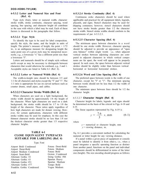
Downloaded from http://www.everyspec.<strong>com</strong> on 2011-10-29T14:56:01.DOD-HDBK-791(AM)6-5.3.2 Letter and Numeral Size and Font(Ref. 4)Type style (font), letter or numeral width, characterstroke width, stroke continuity, character spacing, wordspacing, line spacing. and character height all contributeto the ease with which a label may be read. Each of thesefactors is discussed in the paragraphs that follow.6-5.3.2.1 Type StyleTo identify the type to be used for label <strong>com</strong>position.specify the style, the name, and the height in units oflength. The printer’s measure of height, the point = 1/72in., is an ambiguous measure for designating height thesame point size of a given style may be interpreted incorrectly,e.g., a lowercase “x” has a different point size thana lowercase "f".Letters and numerals should be of simple style withoutserifs except as may be necessary to distinguish betweencharacters that would otherwise be confused, e.g., I and 1.Acceptable styles are listed in Table 6-1 (Ref. 4).6-5.3.2.2 Letter or Numeral Width (Ref. 4)The width-to-height ratio should be between 3:5 and1:1 for all characters and styles except the “I” and "1". The1:1 ratio is appropriate for use on curved surfaces such ascounter drums, small pipes, and cables.6-5.3.2.3 Character Stroke Width (Ref. 4)When characters are used on a light background, thestroke width should be approximately 1/6 the height ofthe character. When light characters are used on a darkbackground, the stroke width should be 1/7 to 1/8 theheight of the character. These ratios apply regardless ofhow high characters are made for distant viewing. However,for certain applications, characters with differentstroke widths may be used for emphasis. In this case thethinnest character stroke should be no less than 1/8 northe thickest character stroke greater than 1/5 respectivecharacter heights.TABLE 6-1CLOSE EQUIVALENT TYPEFACESSUITABLE FOR LABELING (Ref. 4)Type FontAirport Bold CondensedAirport Demi-BoldAirport Medium CondensedAirport Semi-BoldAlternate Gothic #2Alternate Gothic #3Alternate Gothic #51Alternate Gothic #77Franklin Gothic CondensedFutura Demi-BoldFutura MediumFutura BoldGroton Condensedlining Gothic #66Spartan HeavySpartan MediumTempo BoldVogue Medium6-5.3.2.4 Stroke Continuity (Ref. 4)Continuous sroke characters should be used whereappllicable and practical for all equipment labels, legends,placards, and signs. Stencil characters may be used forshipping containers; however, stencil characters shouldnot have stroke breaks greater than 1/2 the characterstroke width. Stencil stroke widths should conform to therequirements of par. 6-5.3.2.3.6-5.3.2.5 Character Spacing (Ref. 4)The minimum space between characters in a wordshould be one stroke width. However, character spacingshould be adjusted to provide an appearance of "openarea balance” within single words i.e., when adjacentvertical strokes between adjoining characters are <strong>com</strong>paredto adjacent characters in which vertical <strong>com</strong>ponentsare far apart, the word will appear to be properlyspaced. In such cases, the space between adjacent verticalstrokes should be slightly wider than between verticalhorizontal or horizontal horizontal strokes.6-5.3.2.6 Word and Line Spacing (Ref. 4)The preferred space between words is the width of onecharacter, except for "I" or "1". The minimum spacingbetween words should not be less than 1/2 the width ofone character.The minimum space between lines should be 1/2 thecharacter height.6-5.3.2.7 Character Height (Ref. 4)Character height for labels, legends. and signs shouldbe determined on the basis of the critcral in Figs. 6-18 and6-19.The linear equation represented by Fig. 6-19 iswherey = numerical or character height, mmy = viewing distance, m.Eq. 6-1 provides a convenient method for calculating thenumeral or letter height for any viewing distance.If a panel within a given piece of equipment or consolemust be labeled to identify it from other-s, i.e., when apanel integrates a specific operating function as distinctfrom another panel, functions on the panel and individual<strong>com</strong>ponents should be differentiated in terms of the lettersize (height). The size encoding should progress as follows6-12


