Art and Design A comprehensive guide for creative artists - Aaltodoc
Art and Design A comprehensive guide for creative artists - Aaltodoc
Art and Design A comprehensive guide for creative artists - Aaltodoc

You also want an ePaper? Increase the reach of your titles
YUMPU automatically turns print PDFs into web optimized ePapers that Google loves.
Jung (2004, 139) remarks, “Of course a colour can st<strong>and</strong> on<br />
its own as well ... Such colour contexts ... are know from<br />
monochrome painting.”<br />
Then again, as we continue to study about colours, on a<br />
colour wheel, we will find harmonious colours that are<br />
also known as analogous colours; usually, such colours are<br />
positioned beside each other, <strong>for</strong> instance blue, blue-green,<br />
blue violet. And they are pleasant to look at because they<br />
appear as if they belong in the same family.<br />
<strong>Art</strong>ists become acquainted with colours when they devote<br />
attention—to interacting with a colour wheel. It works as<br />
a <strong>guide</strong>, which helps <strong>creative</strong> <strong>artists</strong> to underst<strong>and</strong> colours<br />
<strong>and</strong> how they relate to one another.<br />
In accordance with Michael et al.'s (2006, 187-188) remark,<br />
“the purpose of a colour wheel is to exp<strong>and</strong> students<br />
underst<strong>and</strong>ing of colour relationships <strong>and</strong> to assist them in<br />
developing skills of painting <strong>and</strong> drawing with colours.” That<br />
is to say, by underst<strong>and</strong>ing the principles of a colour wheel,<br />
the learner shall be able to develop skills of painting <strong>and</strong> he<br />
or she will discover the absolute importance of using each<br />
colour.<br />
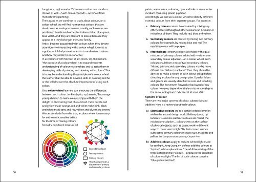
On a colour wheel learners can annotate the differences<br />
between each colour. Jenkins (1980, 142) asserts, “Encourage<br />
young children to name colours. Enjoy with them the<br />
delight in discovering that blue <strong>and</strong> red make purple, red<br />
<strong>and</strong> yellow make orange, red <strong>and</strong> white make pink, black<br />
<strong>and</strong> white make grey <strong>and</strong> red, yellow <strong>and</strong> blue make brown.”<br />
We can conclude from this that, a colour wheel is necessary<br />
<strong>for</strong> enthusiastic <strong>creative</strong> <strong>artists</strong><br />
<strong>for</strong> the time of mixing colours;<br />
from dry powdered mixes of oil<br />
paints, watercolour, colouring dyes <strong>and</strong> inks or any another<br />
medium consisting (paint) pigment.<br />
Accordingly, we can use a colour wheel to identify different<br />
essential colours from their separate groups. For instance:<br />
1. Primary colours cannot be obtained by mixing any<br />
other colours although all other colours can be made or<br />
mixed out of them. They include red, blue <strong>and</strong> yellow.<br />
2. Secondary colours are created by mixing two primary<br />
colours: For example, by mixing blue <strong>and</strong> red. The<br />
resulting colour will be purple.<br />
3. Intermediate (tertiary) colours are made with equal<br />
mixtures of primary colours, added with—either one<br />
secondary colour adjacent—on a colour wheel. Such<br />
colours result from a mix of two secondary colours.<br />
“Mixing primary <strong>and</strong> secondary colours may be more<br />
difficult <strong>for</strong> children to achieve.” Thus, they should be<br />
advised to make a review of each colour group be<strong>for</strong>e<br />
choosing a colour <strong>for</strong> any design plan. Equally, “blues<br />
<strong>and</strong> greens are usually identified as cool <strong>and</strong> receding<br />
colours. The movement <strong>for</strong>ward or backward of any<br />
colour, however, depends entirely on its relationship to<br />
the surrounding hues.” (Michael et al 2007, 188)<br />
Systems of colour<br />
There are two major systems of colour; subtractive <strong>and</strong><br />
additive. Here is a review about each colour:<br />
a) Subtractive colours are to a certain extent common<br />
within the art <strong>and</strong> design world. Bellamy (2004, 14)<br />
laments, “... as more subtractive hues are mixed, the<br />
mix becomes darker ... colours seen on the surface<br />
of physical objects, such as paper, work in different<br />
ways to those seen in light.” By their correct names,<br />
subtractive primary colours include cyan, magenta <strong>and</strong><br />
yellow. See Computer aided printing, Chapter Five.<br />
b) Additive colours apply to radiant (white) light made<br />
by sunlight. Jung (2004, 97) defines additive colours as<br />
“optical.” In his explanations, “the additive mixing of the<br />
three optical primary colours—produces the sensation<br />
of colourless light.” The list of such colours contains<br />
“blue yellow <strong>and</strong> red.”<br />
30 31