Art and Design A comprehensive guide for creative artists - Aaltodoc
Art and Design A comprehensive guide for creative artists - Aaltodoc
Art and Design A comprehensive guide for creative artists - Aaltodoc

Create successful ePaper yourself
Turn your PDF publications into a flip-book with our unique Google optimized e-Paper software.
Michaels (2010) points out some “five characteristics of a<br />
good poster” using the following design expectations:<br />
Does the job<br />
quickly<br />
Gets reader's<br />
attention<br />
It is convincing<br />
Simplicity<br />
Effective use of<br />
colour<br />
The poster must be attractive enough to<br />
bring in your targeted customers.<br />
The poster must be interesting with enough<br />
<strong>for</strong>mation that pertains to suited subjects.<br />
The message is short, with strong<br />
statements to back up what it claims.<br />
The most effective posters are surprisingly<br />
simple <strong>and</strong> straight <strong>for</strong>ward.<br />
The poster must contains a colour scheme,<br />
which can attract more viewers.<br />
Subsequently, a poster can be designed to carry “... a single<br />
image <strong>and</strong> three words of texts ... to be powerful enough<br />
to encourage members of the public to kill themselves”<br />
Barnard (2005, 3) laments.<br />
Distinctively, posters can as well work like transportation<br />
signs. Although, by asserting the opposite—transportation<br />
signs are in general designed to appear like small posters<br />
<strong>for</strong> the reason that, they are displayed inside passenger<br />
trains, buses <strong>and</strong> taxicabs. Sometimes they serve as small<br />
stickers containing longer or detailed messages. Reason<br />
being, travellers or passengers have more time to read<br />
the messages (they bear) during the course of a journey.<br />
Ultimately, learners should be warned about the dangers of<br />
making small <strong>and</strong> horizontal posters.<br />
Such posters do not allow fast drivers or concerned<br />
pedestrian to have a proper or satisfactory glance—to read<br />
<strong>and</strong> interpret a message. That is to say, it is strenuous <strong>for</strong><br />
targeted readers to peruse or read a horizontal poster glued<br />
on a utility pole by walking around. Thus is the apparent<br />
reason as to why the majority of posters are designed to be<br />
displayed in a vertical way; to fit well on advertising boards,<br />
walls, walkway <strong>and</strong> trees in public places— along visible<br />
street spots.<br />
If the purpose intended <strong>for</strong> designing a poster lies on an<br />
event such as a concert, include the date, ticket prices, a<br />
venue as well as illustrations or images. Thereby, a <strong>creative</strong><br />
artist may choose to greatly pronounce the name of the<br />
most famous person—who will steal a march on events to<br />
come.<br />
We can conclude poster designing with Lidwell et al.'s<br />
(2010, 198) “readability” principle. They remind us to “express<br />
complex ... in the simplest way possible by following <strong>guide</strong><br />
lines, which can enhance <strong>and</strong> verify readability level <strong>and</strong><br />
approximates of the intended audience.”<br />
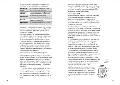
How to design a badge<br />
Badges are <strong>creative</strong>ly composed in very many well-judged<br />
design plans. <strong>Design</strong>ers who create badges start by<br />
acquiring <strong>and</strong> developing a clear enlightenment of<br />
purposes or functions of the expected design. Some badges<br />
are made <strong>for</strong> schools, army or police <strong>and</strong> organised societies,<br />
businesses <strong>and</strong> associations.<br />
Sometimes designers confuse badges with emblems<br />
because they are not easy to distinguish. As a <strong>creative</strong> artist,<br />
it is essential <strong>for</strong> you to underst<strong>and</strong> that be<strong>for</strong>e you begin to<br />
sketch. Exchange cognate views with a person concerned.<br />
It can be a teacher, friends, or the owner of a badge; to<br />
clarify <strong>and</strong>/or review the purpose of the design as well as its<br />
appearance.<br />
At this stage Mead (2008, 30-31) suggests, “investigate the<br />
symbolism of your school ... badge. Inspect closely <strong>and</strong><br />
thoroughly the hidden messages in a range of logos or<br />
symbolic colours of clothing” <strong>for</strong> instance uni<strong>for</strong>ms. They<br />
will <strong>guide</strong> you on how to identify icons, which shall appear<br />
in your design of a badge as well as necessary colours.<br />
Certainly if a badge is designed to promote the identity<br />
of a school or an institution like those mentioned in our<br />
previous analysis. Put some obligatory attention to symbolic<br />
colours which tie-up with the matter at h<strong>and</strong>.<br />
Most schools share instructional m<strong>and</strong>ates <strong>and</strong> activities.<br />
For example, nearly all schools provide knowledge <strong>and</strong> skills<br />
through education to improve the intellectual capabilities<br />
of the learner. Thus, all this <strong>and</strong> more can be used to<br />
<strong>for</strong>mulate some desired icons <strong>for</strong> a badge.<br />
Lidwell et al. (2010, 132) remind us that “iconic representations<br />
reduce per<strong>for</strong>mance load ... when representations<br />
are to be used ...” That is to say; your<br />
planned badge should display a summary of some<br />
desired ambitions that are relevant to the stated<br />
subject matter.<br />
106 107<br />
Banner<br />
Banner<br />
A specimen<br />
of a school<br />
badge<br />
Shield<br />
Icons