Art and Design A comprehensive guide for creative artists - Aaltodoc
Art and Design A comprehensive guide for creative artists - Aaltodoc
Art and Design A comprehensive guide for creative artists - Aaltodoc
Create successful ePaper yourself
Turn your PDF publications into a flip-book with our unique Google optimized e-Paper software.
Proportion<br />
It can be used to work out a balance of parts<br />
on a layout. That is to say, the importance of<br />
proportion on layouts is closely related with<br />
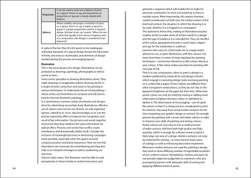
generate a response which will enable him to make his<br />
personal contribution to what is provided by a client or<br />
outside source. Most importantly, this require showing<br />
balance.<br />
careful consideration of both text, the verbal content of the<br />
Balance<br />
Allows stability <strong>and</strong> proper correlation of parts<br />
on a layout. That is to say, it makes a layout to<br />
appear in proper proportions <strong>and</strong> <strong>for</strong> a required<br />
design. Michael (2006, 191) asserts, “When the eye<br />
brief <strong>and</strong> context, the situation in which the drawing is to<br />
be used, whether it is a magazine or newspaper.”<br />
This statement shows that, making an Illustration requires<br />
is attracted equally to the various imaginary axes<br />
<strong>creative</strong> <strong>artists</strong> to make sense of written words in a design<br />
of a composition, the design is considered to be<br />
balanced.”<br />
<strong>and</strong> the type of audience it is intended <strong>for</strong>. Thus, be mindful<br />
of the culture, geographical location, social status, religion<br />
In spite of the fact that this list seems to be inadequate,<br />
individual dem<strong>and</strong>s of a layout design dictate the full extent<br />
of limits <strong>and</strong> choices of principles <strong>and</strong> elements of design<br />
needed during the process of arranging layouts.<br />
<strong>and</strong> age <strong>for</strong> the readership or audience.<br />
Learners who carry on school tasks are to a large extent<br />
advised to use, or paint illustrations with few colours; not<br />
more than three. In series of steps regulated by painting<br />
techniques—commonly referred to as flat colours (block or<br />
Illustration<br />
spot colour). A flat colour makes provision <strong>for</strong> printing with<br />
This is the pictorial part of a design. Illustrations can be<br />
one type of ink.<br />
produced as drawings, paintings, photographs as well as<br />
That is to say, using poster colour to paint a design is a<br />
words or texts.<br />
medium preferred by nearly all art <strong>and</strong> design schools,<br />
Some <strong>artists</strong> specialise in drawing illustrations alone. They<br />
which engage in executing design tasks involving painting<br />
make drawings in imaginative realism showing stories in<br />
on a surface like a paper. Poster colours are different from<br />
a single artwork; using lines <strong>and</strong> tones or by painting in<br />
other transparent watercolours, as they do not rely on the<br />
various techniques. To underst<strong>and</strong> the art of storytelling—<br />
apparent brightness of the paper <strong>for</strong> their tints. Otherwise,<br />
where <strong>artists</strong> use illustrations to compose <strong>and</strong> tell stories,<br />
poster colour can only be tinted by mixing or adding more<br />
look <strong>for</strong> Norman Rockwell's paintings.<br />
white paint to lighten the base colour, or add black to<br />
In a spontaneous manner, nearly all artworks <strong>and</strong> designs<br />
darken it. The ideal reason of encouraging—use of (spot)<br />
done <strong>for</strong> advertising necessitate lively illustrations, effective<br />
flat colours is that; it is cheap <strong>and</strong> less complicated to print.<br />
use of colours <strong>and</strong> concise use of texts, on well organised<br />
As a learner, stay away from using markers <strong>and</strong> pens <strong>for</strong> the<br />
layouts. Lidwell et al. (2010, 184) encourages us to “use the<br />
time of painting your graphic design or artwork. Do enough<br />
picture superiority effect to improve the recognition <strong>and</strong><br />
practice by painting with a brush <strong>and</strong> water colours in order<br />
recall of key in<strong>for</strong>mation. Use pictures <strong>and</strong> words together<br />
to improve your skills of painting <strong>and</strong> mixing colours.<br />
<strong>and</strong> ensure that they rein<strong>for</strong>ce the same in<strong>for</strong>mation <strong>for</strong><br />
Poster colours are very easy to mix in small amounts<br />
optical effect. Pictures <strong>and</strong> words that conflict create<br />
of water <strong>and</strong> you will have both high quality <strong>and</strong> high<br />
interference <strong>and</strong> dramatically inhibit recall. Consider the<br />
quantity, which is enough <strong>for</strong> a decent smear to paint a<br />
inclusion of meaningful pictures in advertising campaigns<br />
fairly large size area of a design. Markers <strong>and</strong> pens can only<br />
when possible, especially when the goal is to build<br />
be endorsed <strong>for</strong> writing—in some hard to reach areas<br />
company product <strong>and</strong> br<strong>and</strong> awareness.” Here we see that<br />
of a design as well as enhancing decorative treatments.<br />
illustrations are necessary <strong>for</strong> remembering <strong>and</strong> they also<br />
Whenever markers <strong>and</strong> pens are used <strong>for</strong> painting a design;<br />
help us to interpret messages as well as awakening our<br />
they tend to show differing varieties of regrettable tonalities<br />
reactions.<br />
of non-uni<strong>for</strong>m colours. Nonetheless, markers <strong>and</strong> pens do<br />
Ashwin (1982) notes, “the illustrator must be able to read<br />
not provide subjective judgement to examiners who aim<br />
perceptively, to listen closely to verbal instructions <strong>and</strong><br />
at preparing learners with adequate skills of mixing <strong>and</strong><br />
applying different kinds of paints.<br />
94 95


