Art and Design A comprehensive guide for creative artists - Aaltodoc
Art and Design A comprehensive guide for creative artists - Aaltodoc
Art and Design A comprehensive guide for creative artists - Aaltodoc

Create successful ePaper yourself
Turn your PDF publications into a flip-book with our unique Google optimized e-Paper software.
Lowercase<br />
The lowercase alphabets are constructed in a smaller <strong>for</strong>m<br />
as compared to upper cases. In Swanson's (2000, 105)<br />
typography of lower <strong>and</strong> uppercase: “Words are perceived<br />
by their specific word-shape outline, which is unique <strong>for</strong><br />
lowercase ... one researcher found that more reading errors<br />
were made in reading lowercase words than words set in all<br />
caps, indicating that all caps words are indeed read letter by<br />
letter, while lowercase words are not.”<br />
It is absolutely important <strong>for</strong> the learner to first of all look<br />
<strong>and</strong> judge the different ways—lowercase letters can fit on a<br />
well composed design or sentences be<strong>for</strong>e putting then to<br />
any final use.<br />
Let us use the table below to make a clear analysis of the<br />
stylistic representation of lowercase (type) <strong>and</strong> how they<br />
appear with straight <strong>and</strong> round strokes:<br />
Round <strong>and</strong>/or with a stroke<br />
Round, straight strokes above <strong>and</strong> below<br />
Straight, round <strong>and</strong> open strokes<br />
Upright, straight with a single stroke<br />
Straight with slanting or oblique strokes<br />
Use a sketch book <strong>and</strong> draw each letter carefully. Pay<br />
attention to the extremely useful strokes (above <strong>and</strong> below<br />
on specific letters) be mindful of their individual shapes as<br />
well as the different ways each letter can cause an impact<br />
on a word or sentences. You can make your own grid of<br />
squares.<br />
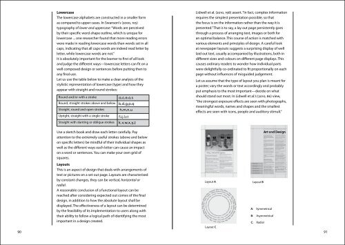
Layouts<br />
This is an aspect of design that deals with arrangements of<br />
text or pictures on a set out page. Layouts are characterised<br />
by constant changes, they can be vertical, horizontal or<br />
radial.<br />
A reasonable conclusion of a functional layout can be<br />
reached after considering expected out comes of the final<br />
design, in addition to how the absolute layout shall be<br />
displayed. The effectiveness of a layout can be determined<br />
by the feasibility of its implementation to users along with<br />
their ability to follow a logical path of identifying the most<br />
important in a design created.<br />
Lidwell et al. (2010, 198) assert. “In fact, complex in<strong>for</strong>mation<br />
requires the simplest presentation possible, so that<br />
the focus is on the in<strong>for</strong>mation rather than the way it is<br />
presented.” That is to say, a lay out page persistently goes<br />
through a process of arranging text, images or both <strong>for</strong><br />
an optimal balance. This course of action is matched with<br />
various elements <strong>and</strong> principles of design. A careful look<br />
at newspaper layouts suggests a surprising display of well<br />
laid out text, usually accompanied by illustrations, both in<br />
different sizes <strong>and</strong> colours on different page displays. This<br />
causes ordinary readers to wonder how individual parts<br />
were delightfully co-ordinated to fit proportionally on each<br />
page without influences of mis<strong>guide</strong>d judgement.<br />
Let us assume that the type of layout you plan is meant <strong>for</strong><br />
a poster; vary the words or text accordingly <strong>and</strong> probably<br />
put emphasis to the most important—decide on what<br />
should st<strong>and</strong> out most. In Lidwell et al.'s (2010, 86) view,<br />
“the strongest exposure effects are seen with photographs,<br />
meaningful words, names <strong>and</strong> shapes <strong>and</strong> the smallest<br />
effects are seen with icons, people <strong>and</strong> auditory stimuli.”<br />
Layout C<br />
90 91<br />
Layout A<br />
Layout B<br />
A: Symmetrical<br />
B: Asymmetrical<br />
C: Radial