Art and Design A comprehensive guide for creative artists - Aaltodoc
Art and Design A comprehensive guide for creative artists - Aaltodoc
Art and Design A comprehensive guide for creative artists - Aaltodoc

Create successful ePaper yourself
Turn your PDF publications into a flip-book with our unique Google optimized e-Paper software.
Phillips (2004, 9) reminds us that “there are many design<br />
It is important to think about meaning <strong>and</strong> function in<br />
projects that could be classified as routine or on going that<br />
typography. Spiekermann et al. (1993, 54) in<strong>for</strong>m us that<br />
would not require a <strong>for</strong>mal design brief.” Thereby, a design<br />
“ever since, people have been writing things down. They<br />
brief may be as simple as drafting a short description, which<br />
have had to consider their audiences be<strong>for</strong>e they actually<br />
will assist a user group <strong>and</strong> <strong>for</strong> explaining the purpose of<br />
put a pen on paper.”<br />
the product you have created.<br />
The type used on a design is there<strong>for</strong>e expected to be<br />
Features of a graphic design<br />
applicable to the matter at h<strong>and</strong>. For instance, targeted<br />
In general, graphic designers compose visual artworks in<br />
audiences include people of different age groups, sex,<br />
very many ways. As an example, the design created may<br />
religion, lifestyle, culture <strong>and</strong> customs. As a graphic<br />
sometimes contain “images, texts ... to naturalise specific<br />
designer, it is essential to use—easy to read type,<br />
meanings of connotations” Barnard (2005, 38) notes.<br />
particularly when the message is written <strong>for</strong> very young<br />
As a result of that, on a basic visual or communication<br />
children.<br />
design you are more likely to find the following mysterious<br />
Fortunately, <strong>creative</strong> graphic designers today have a wide<br />
fascinations:<br />
range of type to choose from. We can underst<strong>and</strong> that from<br />
(a) the image (illustration)<br />
Galbreath's (2008, 36) assertions that “by choosing type<br />
faces <strong>and</strong> arranging then on the pages of your book: are<br />
(b) typography (relies on)<br />
the essential steps in creating an inviting <strong>and</strong> appropriate<br />
(c) a layout—to communicate or present a message<br />
atmosphere ...” that conveys positive visual messages.<br />
Fiell & Charlotte (2007) say, to get a message across “today's<br />
graphic designers have to be ever-more aware of the<br />
fast-moving currents characterised with short attention<br />
spans.” Readers today, pay less attention as a result of<br />
the tedious repetitions of in<strong>for</strong>ming messages found on<br />
streets, walls, hallways <strong>and</strong> notice boards “... which leads<br />
to a natural empathy—caused by technology.” Doubtless,<br />
then, the necessary messages that we use to officially<br />
announce visual utterances on most graphic designs<br />
calls <strong>for</strong> simplicity, clearness or clarity <strong>and</strong> it is vital to<br />
make every part of a graphic design visible, readable <strong>and</strong><br />
underst<strong>and</strong>able.<br />
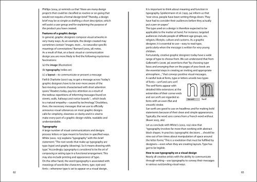
A careful look at fonts, type or letters unveils two types<br />
of fonts—serif <strong>and</strong> sans serif.<br />
The serif fonts appear with<br />
detailed little extensions at the<br />
extremities of their corner ends<br />
<strong>and</strong> san serifs are regarded as<br />
San serif Serif<br />
fonts with an even (flat <strong>and</strong><br />
smooth) stroke.<br />
San serifs are good to use on headlines <strong>and</strong> <strong>for</strong> making bold<br />
statements because of their clean <strong>and</strong> simple appearances.<br />
Typically, the word sans comes from a French word without.<br />
(Buser 2005, 282)<br />
Typography<br />
A large number of visual communications <strong>and</strong> designs<br />
possess letters or type meant to function in specified ways.<br />
White (2002, 103) explains “typography” with this brief<br />
statement; “The root words that make up typography are<br />
typo (type) <strong>and</strong> graphy (drawing). So it means drawing with<br />
type.” Accordingly, typography is considered to be the art of<br />
Let us conclude with White's (2002, 103) view that<br />
“typography involves far more than working with abstract<br />
black shapes. In practice, typographic decisions ... should be<br />
nine out of ten times about manipulation of space around<br />
the letter <strong>for</strong>ms.” This is a revelation that must be fulfilled by<br />
designers—even when they are creating layouts. Type has<br />
got to be legible.<br />
composing or setting type in a functional arrangement. This<br />
How to use typography on a visual design<br />
may also include printing <strong>and</strong> appearance of type.<br />
Nearly all <strong>creative</strong> <strong>artists</strong> with the ability to communicate<br />
On the other h<strong>and</strong>, the word typography is associated with<br />
through writing—use typography to convey their messages<br />
meanings of words like characters, letters, type, style <strong>and</strong><br />
fonts—whenever type is set to appear on a visual design.<br />
in various outst<strong>and</strong>ing visual ways.<br />
82 83