


You also want an ePaper? Increase the reach of your titles
YUMPU automatically turns print PDFs into web optimized ePapers that Google loves.
IFTA JOURNAL<br />
2017 EDITION<br />
The ticker tape revealed price, volume, and time relationships<br />
that were advantageously captured by charts.<br />
The Wyckoff Matrix: Coordinating<br />
Bar Charts With Figure Charts<br />
Under the Wyckoff Method, it is significant for the technical<br />
analyst to appreciate that the Figure Chart (i.e., Point-and-<br />
Figure Chart) plays a supplementary and complementary role to<br />
the Vertical Line Chart (i.e., Bar Chart).<br />
With its component of volume, the bar chart/vertical chart<br />
was looked upon by R.D. Wyckoff as a superior instrument<br />
for the diagnoses of trends and trading ranges. Therefore, the<br />
technician-trader should start with the bar chart, comparing<br />
successive waves of buying and selling, comprising price and<br />
volume, over time. That diagnostic process should reveal the<br />
relative power of demand vs. supply forces in the market. This<br />
diagnosis would uncover the bullish or bearish intentions of the<br />
powerful interests operating in the stock market. They were<br />
referred to as the “smart money” and conceptualized as “the<br />
composite man” or “the composite operator” by Wyckoff.<br />
Wyckoff asserted that “three market laws” enabled the<br />
trader–analyst to discern the intentions of the dominant<br />
forces operating in a stock, commodity, or market as a whole.<br />
The first and by far the most prominent law was that of supply<br />
and demand. Simply stated, this law said that if demand was<br />
more powerful than supply, then price would rise. Likewise, if<br />
supply were dominant or in control, then prices would decline.<br />
Hence, the law of supply and demand was the proper concept to<br />
explain the present position and probable future trend of price<br />
in a market. Wyckoff counseled analysts and traders to rely<br />
on the Vertical Line or Bar Chart because it was the superior<br />
instrument for diagnosing small as well as large price swings in<br />
the market.<br />
Closely allied to the law of supply and demand was the law<br />
of effort vs. result. When a divergence or disharmony between<br />
price and volume action occurred, the trader-analyst would<br />
become alert for a probable change in trend direction. Thus, the<br />
law of effort (volume) vs. result (price) was valuable for alerting<br />
the analyst–trader to an imminent change in trend direction.<br />
The third law for ascertaining the intention of the Composite<br />
Man was the Law of Cause and Effect. Essentially, this third<br />
law said that a sideways trading range would create a cause,<br />
and the subsequent trend would be the result of that cause.<br />
Furthermore, the law stated that there existed a direct one-toone<br />
proportion between cause and effect. Thus, for every effect,<br />
there would have been a preceding cause built up. In other<br />
words, the buildup of a cause in a trading range would measure<br />
the exact extent of accumulation or distribution. The resulting<br />
trend was then the realization of that buildup.<br />
In sum, a significant quantifiable law linked the cause to the<br />
effect. The quantitative relationship between cause and effect<br />
was that of equal proportionality or a one-to-one relationship.<br />
The instrument used by Wyckoff to measure the extent of<br />
a cause built up during trading range was the Figure Chart. A<br />
powerful and unique quantification was the special function of<br />
the figure chart, according to Wyckoff. During the early 1930s,<br />
Wyckoff and Associates promulgated guidelines for the proper<br />
construction of figure charts and the appropriate interpretation<br />
of figure charts. Those evolved into what ultimately became<br />
known as the Wyckoff Count Guide.<br />
Both the figure chart and the bar chart grew out of the oldtime<br />
trader’s (19th and early 20th century) reading of the ticker<br />
tape of transactions. One of the initial appeals of the figure<br />
chart was its simplicity and ease for recording price changes.<br />
On the other hand, the bar chart was capable of displaying a<br />
rich array of price and volume activity. The bar chart was an<br />
excellent instrument for capturing the pulse of a market. The<br />
bar chart had the requisite sensitivity needed to discern the<br />
motives of the Composite Man on one side and the behavior<br />
of the crowd (i.e., the general public) on the other. The flow of<br />
information and logic placed the bar chart in a leading analytical<br />
position. The information furnished by the bar chart was ideal<br />
for the application of the law of supply and demand and for<br />
interpreting the law of effort vs. result.<br />
In your own technical work leading to action, the bar chart<br />
should commence your analysis. This necessitates the proper<br />
interpretation of the phases within a sideways trading range. It<br />
is crucial to judge the culmination of the sideways trading range<br />
or the transition point separating markup from accumulation<br />
(LPS) or the last point of supply after distribution (LPSY). An<br />
excellent depiction of the Wyckoff Method of understanding<br />
the phases of a trading range was furnished in the widely read<br />
article that appeared in the 1994 issue of the MTA Journal (i.e.,<br />
Jim Forte, CMT, “The Anatomy of a Trading Range”).<br />
Once the boundaries of a trading range have been established<br />
and the LPS or LPSY has been identified on the bar chart, the<br />
analyst–trader is then ready to consult the figure chart of the<br />
same trading range in order to conduct the quantification of the<br />
potential (i.e., “the count”). (See sidebar: The Wyckoff Count<br />
Guide.)<br />
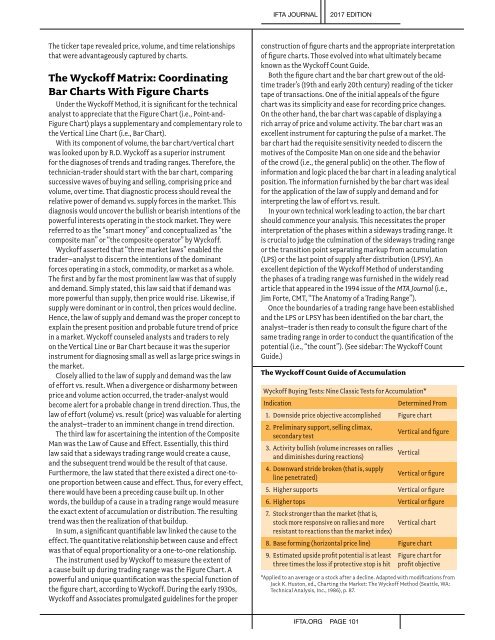
The Wyckoff Count Guide of Accumulation<br />
Wyckoff Buying Tests: Nine Classic Tests for Accumulation*<br />
Indication<br />
Determined From<br />
1. Downside price objective accomplished Figure chart<br />
2. Preliminary support, selling climax,<br />
secondary test<br />
3. Activity bullish (volume increases on rallies<br />
and diminishes during reactions)<br />
4. Downward stride broken (that is, supply<br />
line penetrated)<br />
Vertical and figure<br />
Vertical<br />
Vertical or figure<br />
5. Higher supports Vertical or figure<br />
6. Higher tops Vertical or figure<br />
7. Stock stronger than the market (that is,<br />
stock more responsive on rallies and more<br />
resistant to reactions than the market index)<br />
Vertical chart<br />
8. Base forming (horizontal price line) Figure chart<br />
9. Estimated upside profit potential is at least<br />
three times the loss if protective stop is hit<br />
Figure chart for<br />
profit objective<br />
*Applied to an average or a stock after a decline. Adapted with modifications from<br />
Jack K. Huston, ed., Charting the Market: The Wyckoff Method (Seattle, WA:<br />
Technical Analysis, Inc., 1986), p. 87.<br />
IFTA.ORG PAGE 101