Spry User Guide - Support - Adobe
Spry User Guide - Support - Adobe
Spry User Guide - Support - Adobe
You also want an ePaper? Increase the reach of your titles
YUMPU automatically turns print PDFs into web optimized ePapers that Google loves.
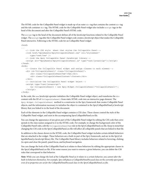
The HTML code for the Collapsible Panel widget is made up of an outer div tag that contains the content div tag<br />
and the tab container div tag. The HTML code for the Collapsible Panel widget also includes script tags in the<br />
head of the document and after the Collapsible Panel’s HTML code.<br />
The script tag in the head of the document defines all of the JavaScript functions related to the Collapsible Panel<br />
widget. The script tagaftertheCollapsiblePanelwidgetcodecreatesaJavaScriptobjectthatmakestheCollapsible<br />
Panel interactive. Following is the HTML code for an Collapsible Panel widget:<br />
<br />
...<br />
<br />
<br />
<br />
<br />
<br />
<br />
<br />
<br />
Tab<br />
Content<br />
<br />
<br />
<br />
var CollapsiblePanel1 = new <strong>Spry</strong>.Widget.CollapsiblePanel("CollapsiblePanel1");<br />
<br />
<br />
In the code, the new JavaScript operator initializes the Collapsible Panel widget object, and transforms the div<br />
content with the ID of CollapsiblePanel1 from static HTML code into an interactive page element. The<br />
<strong>Spry</strong>.Widget.CollapsiblePanel method is a constructor in the <strong>Spry</strong> framework that creates Collapsible Panel<br />
objects, and the information necessary to initialize the object is contained in the <strong>Spry</strong>CollapsiblePanel.js JavaScript<br />
library that you linked to in the head of the document.<br />
Each of the elements in the Collapsible Panel widget contains a CSS class. These classes control the style of the<br />
Collapsible Panel widget, and exist in the accompanying <strong>Spry</strong>CollapsiblePanel.css file.<br />
SPRY<br />
<strong>User</strong> <strong>Guide</strong><br />
You can change the appearance of any given part of the Collapsible Panel widget by editing the CSS code that corresponds<br />
to the class names assigned to it in the HTML code. For example, to change the background color of the<br />
CollapsiblePanel’stabs,edittheCollapsiblePanelTab rule in the <strong>Spry</strong>CollapsiblePanel.css file. Keep in mind that<br />
changing the CSS code in the <strong>Spry</strong>CollapsiblePanel.css file will affect all collapsible panels that are linked to that file.<br />
In addition to the classes shown in the HTML code, the Collapsible Panel widget includes certain default behaviors<br />
that are attached to the widget. These behaviors are a built-in part of the <strong>Spry</strong> framework, and are in the <strong>Spry</strong>CollapsiblePanel.js<br />
JavaScript library file. The Collapsible Panel library includes behaviors related to hovering, clicking<br />
(to open and close the panel), panel focus, and keyboard navigation.<br />
YoucanchangethelookoftheCollapsiblePanelasitrelatestothesebehaviorsbyeditingtheappropriateclassesin<br />
the <strong>Spry</strong>CollapsiblePanel.css file. If for some reason you want to remove a given behavior, you can delete the CSS<br />
rules that correspond to that behavior.<br />
Note: While you can change the look of the Collapsible Panel as it relates to a certain behavior, you cannot alter the<br />
built-in behaviors themselves. For example, <strong>Spry</strong> still places a CollapsiblePanelFocused class on the currently open panel,<br />
even if no properties are set for the CollapsiblePanelFocused class in the <strong>Spry</strong>CollapsiblePanel.css file.<br />
15


