

Spry User Guide - Support - Adobe
Spry User Guide - Support - Adobe
Spry User Guide - Support - Adobe

You also want an ePaper? Increase the reach of your titles
YUMPU automatically turns print PDFs into web optimized ePapers that Google loves.
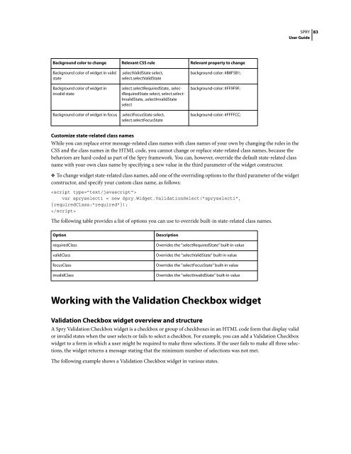
Background color to change Relevant CSS rule Relevant property to change<br />
Background color of widget in valid<br />
state<br />
Background color of widget in<br />
invalid state<br />
.selectValidState select,<br />
select.selectValidState<br />
select.selectRequiredState, .selectRequiredState<br />
select, select.select-<br />
InvalidState, .selectInvalidState<br />
select<br />
Background color of widget in focus .selectFocusState select,<br />
select.selectFocusState<br />
Customize state-related class names<br />
Whileyoucanreplaceerrormessage-relatedclassnameswithclassnamesofyourownbychangingtherulesinthe<br />
CSS and the class names in the HTML code, you cannot change or replace state-related class names, because the<br />
behaviors are hard-coded as part of the <strong>Spry</strong> framework. You can, however, override the default state-related class<br />
name with your own class name by specifying a new value in the third parameter of the widget constructor.<br />
❖ To change widget state-related class names, add one of the overriding options to the third parameter of the widget<br />
constructor, and specify your custom class name, as follows:<br />
<br />
var spryselect1 = new <strong>Spry</strong>.Widget.ValidationSelect("spryselect1",<br />
{requiredClass:"required"});<br />
<br />
The following table provides a list of options you can use to override built-in state-related class names.<br />
Option Description<br />
background-color: #B8F5B1;<br />
background-color: #FF9F9F;<br />
background-color: #FFFFCC;<br />
requiredClass Overrides the "selectRequiredState" built-in value<br />
validClass Overrides the "selectValidState" built-in value<br />
focusClass Overrides the "selectFocusState" built-in value<br />
invalidClass Overrides the "selectInvalidState" built-in value<br />
Working with the Validation Checkbox widget<br />
SPRY<br />
<strong>User</strong> <strong>Guide</strong><br />
Validation Checkbox widget overview and structure<br />
A<strong>Spry</strong>ValidationCheckboxwidgetisacheckboxorgroupofcheckboxesinanHTMLcodeformthatdisplayvalid<br />
or invalid states when the user selects or fails to select a checkbox. For example, you can add a Validation Checkbox<br />
widget to a form in which a user might be required to make three selections. If the user fails to make all three selections,<br />
the widget returns a message stating that the minimum number of selections was not met.<br />
The following example shows a Validation Checkbox widget in various states.<br />
83


 Change language