

Spry User Guide - Support - Adobe
Spry User Guide - Support - Adobe
Spry User Guide - Support - Adobe

You also want an ePaper? Increase the reach of your titles
YUMPU automatically turns print PDFs into web optimized ePapers that Google loves.
IntheCSSintheprecedingcode,youcanseethatthestaterulewiththecontextualselector.textareaRequired-<br />
State . textareaRequiredMsg overrides the default error-message rule responsible for hiding the error message<br />
text. Thus, when <strong>Spry</strong> applies the state class to the widget container, the state rule determines the appearance of the<br />
widget, and displays the error message inline in red with a 1-pixel solid border.<br />
Following is a list of default error-message classes and their descriptions. You can change these classes and rename<br />
them to anything you want. If you do so, don’t forget to change them in the contextual selector also.<br />
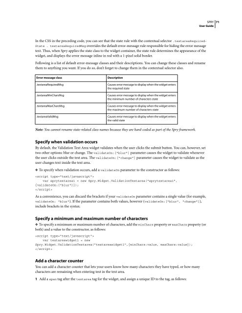
Error message class Description<br />
.textareaRequiredMsg Causes error message to display when the widget enters<br />
the required state<br />
.textareaMinCharsMsg Causes error message to display when the widget enters<br />
the minimum number of characters state<br />
.textareaMaxCharsMsg Causes error message to display when the widget enters<br />
the maximum number of characters state<br />
.textareaValidMsg Causes error message to display when the widget enters<br />
the valid state<br />
Note: You cannot rename state-related class names because they are hard-coded as part of the <strong>Spry</strong> framework.<br />
Specify when validation occurs<br />
By default, the Validation Text Area widget validates when the user clicks the submit button. You can, however, set<br />
two other options: blur or change. The validateOn:["blur"] parameter causes the widget to validate whenever<br />
the user clicks outside the text area. The validateOn:["change"] parameter causes the widget to validate as the<br />
user changes text inside the text area.<br />
❖ To specify when validation occurs, add a validateOn parameter to the constructor as follows:<br />
<br />
var sprytextarea1 = new <strong>Spry</strong>.Widget.ValidationTextarea("sprytextarea1",<br />
{validateOn:["blur"]});<br />
<br />
As a convenience, you can discard the brackets if your validateOn parameter contains a single value (for example,<br />
validateOn: "blur"). If the parameter contains both values, however (validateOn:["blur", "change"]),<br />
include brackets in the syntax.<br />
Specify a minimum and maximum number of characters<br />
❖ To specify a minimum or maximum number of characters, add the minChars property or maxChars property (or<br />
both) and a value to the constructor, as follows:<br />
<br />
var textareawidget1 = new<br />
<strong>Spry</strong>.Widget.ValidationTextarea("textareawidget1",{minChars:value, maxChars:value});<br />
<br />
Add a character counter<br />
You can add a character counter that lets your users know how many characters they have typed, or how many<br />
characters are remaining when entering text in the text area.<br />
1 Add a span tag after the textarea tag for the widget, and assign a unique ID to the tag, as follows:<br />
SPRY<br />
<strong>User</strong> <strong>Guide</strong><br />
71


 Change language