

Spry User Guide - Support - Adobe
Spry User Guide - Support - Adobe
Spry User Guide - Support - Adobe

You also want an ePaper? Increase the reach of your titles
YUMPU automatically turns print PDFs into web optimized ePapers that Google loves.
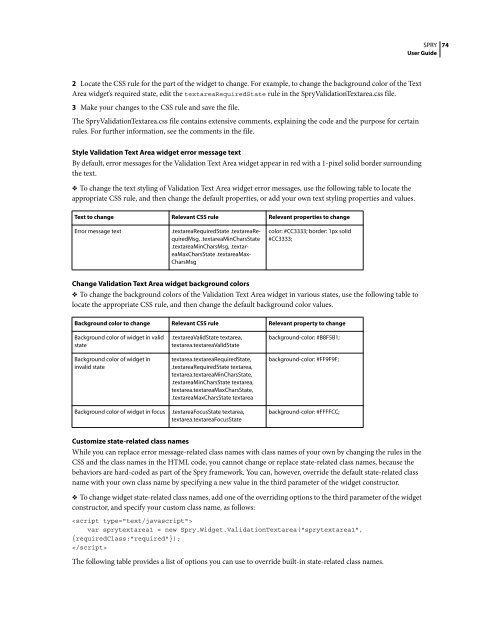
2 Locate the CSS rule for the part of the widget to change. For example, to change the background color of the Text<br />
Area widget’s required state, edit the textareaRequiredState rule in the <strong>Spry</strong>ValidationTextarea.css file.<br />
3 Make your changes to the CSS rule and save the file.<br />
The <strong>Spry</strong>ValidationTextarea.css file contains extensive comments, explaining the code and the purpose for certain<br />
rules. For further information, see the comments in the file.<br />
Style Validation Text Area widget error message text<br />
By default, error messages for the Validation Text Area widget appear in red with a 1-pixel solid border surrounding<br />
the text.<br />
❖ To change the text styling of Validation Text Area widget error messages, use the following table to locate the<br />
appropriate CSS rule, and then change the default properties, or add your own text styling properties and values.<br />
Text to change Relevant CSS rule Relevant properties to change<br />
Error message text .textareaRequiredState .textareaRequiredMsg,<br />
.textareaMinCharsState<br />
.textareaMinCharsMsg, .textareaMaxCharsState<br />
.textareaMax-<br />
CharsMsg<br />
color: #CC3333; border: 1px solid<br />
#CC3333;<br />
Change Validation Text Area widget background colors<br />
❖ To change the background colors of the Validation Text Area widget in various states, use the following table to<br />
locate the appropriate CSS rule, and then change the default background color values.<br />
Background color to change Relevant CSS rule Relevant property to change<br />
Background color of widget in valid<br />
state<br />
Background color of widget in<br />
invalid state<br />
.textareaValidState textarea,<br />
textarea.textareaValidState<br />
textarea.textareaRequiredState,<br />
.textareaRequiredState textarea,<br />
textarea.textareaMinCharsState,<br />
.textareaMinCharsState textarea,<br />
textarea.textareaMaxCharsState,<br />
.textareaMaxCharsState textarea<br />
Background color of widget in focus .textareaFocusState textarea,<br />
textarea.textareaFocusState<br />
background-color: #B8F5B1;<br />
background-color: #FF9F9F;<br />
background-color: #FFFFCC;<br />
Customize state-related class names<br />
Whileyoucanreplaceerrormessage-relatedclassnameswithclassnamesofyourownbychangingtherulesinthe<br />
CSS and the class names in the HTML code, you cannot change or replace state-related class names, because the<br />
behaviors are hard-coded as part of the <strong>Spry</strong> framework. You can, however, override the default state-related class<br />
name with your own class name by specifying a new value in the third parameter of the widget constructor.<br />
❖ To change widget state-related class names, add one of the overriding options to the third parameter of the widget<br />
constructor, and specify your custom class name, as follows:<br />
<br />
var sprytextarea1 = new <strong>Spry</strong>.Widget.ValidationTextarea("sprytextarea1",<br />
{requiredClass:"required"});<br />
<br />
The following table provides a list of options you can use to override built-in state-related class names.<br />
SPRY<br />
<strong>User</strong> <strong>Guide</strong><br />
74


 Change language